Microsoft : Surface Book
Review by Gerry Mayer
The Surface Book by Microsoft was released in 2015 and is the first Microsoft designed laptop with a removable screen, a clear development from their Surface Pro product line. Essentially the top screen is a Surface Pro with a high quality keyboard base that includes more batteries, a dedicated graphics card, and additional ports. The additional flexibility of being able to remove the screen really comes in handy when I want to sketch something and show it to a group of people.
The Surface Book is constructed from mostly cast magnesium and some plastic parts, which have been painted the same metallic paint. This thin layer of paint makes the even magnesium parts feel a bit plasticy but much lighter Apple's aluminum Macbook. This smooth paint gives a slightly more matte appearance than the Macbook that feels more subtle and perhaps a bit higher end. The corners are rounded but all of the faces have a hard edge, following the Microsoft geometric form language. This hard edge tends to press into your hands and arms if the laptop is in your lap but on a hard surface they are so thin that they disappear.
On the right side we can see the headphone jack, mini display port, and magnetic charge cable port. The hinge on the Surface Book is totally amazing. It's visual and mechanical and you can immediately understand how it works. From this view, we can see the intentional gap between the keyboard and screen that keeps the keys from pressing against the glass screen. This gap also creates an area for shadow which helps to communicate that the base, hinge, and screen are all part of a consistantly thick volume that bends in half.
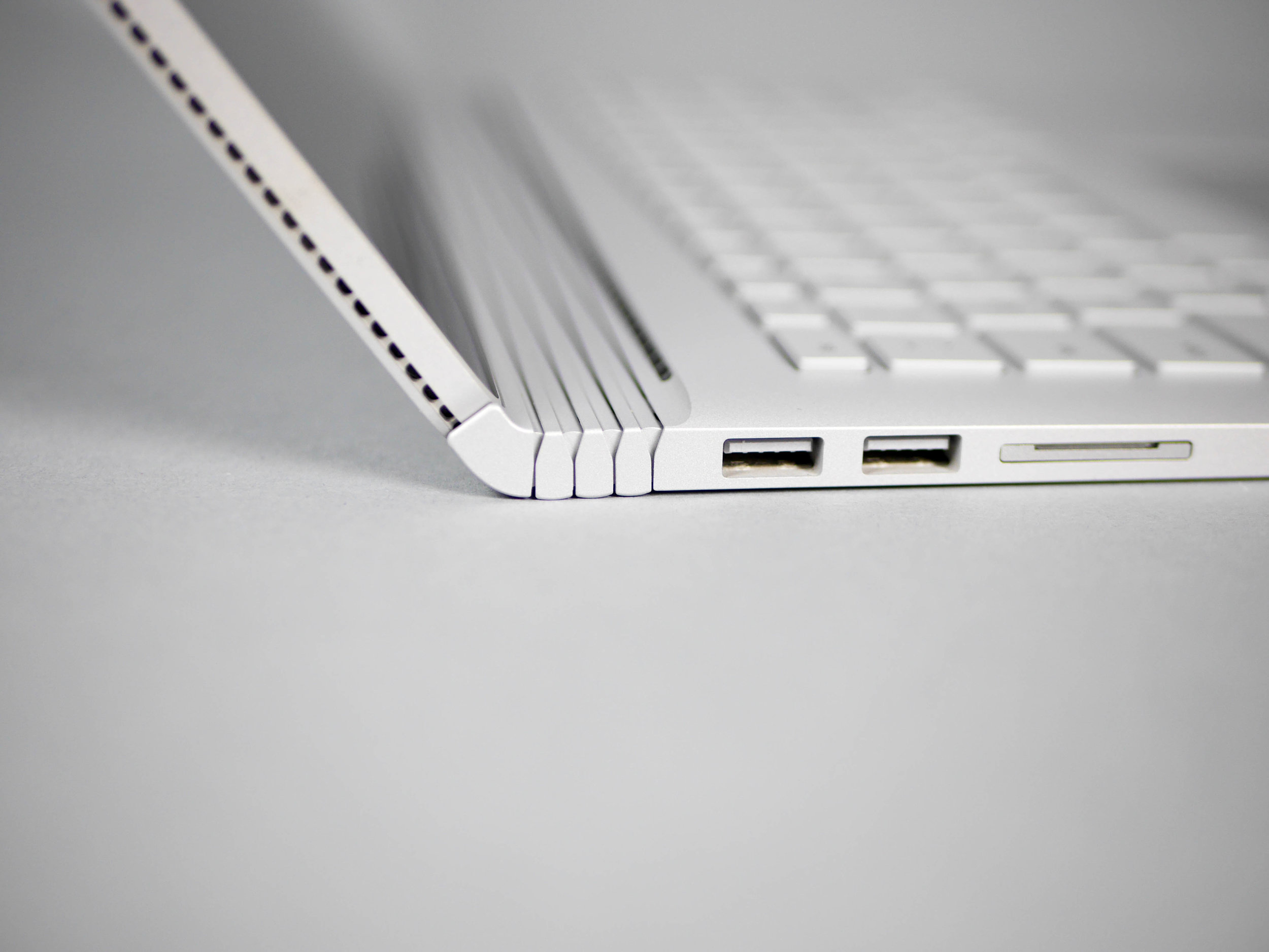
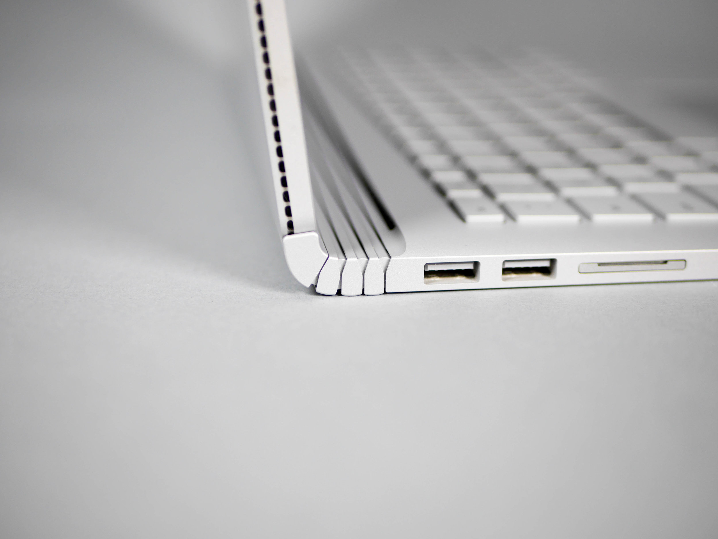
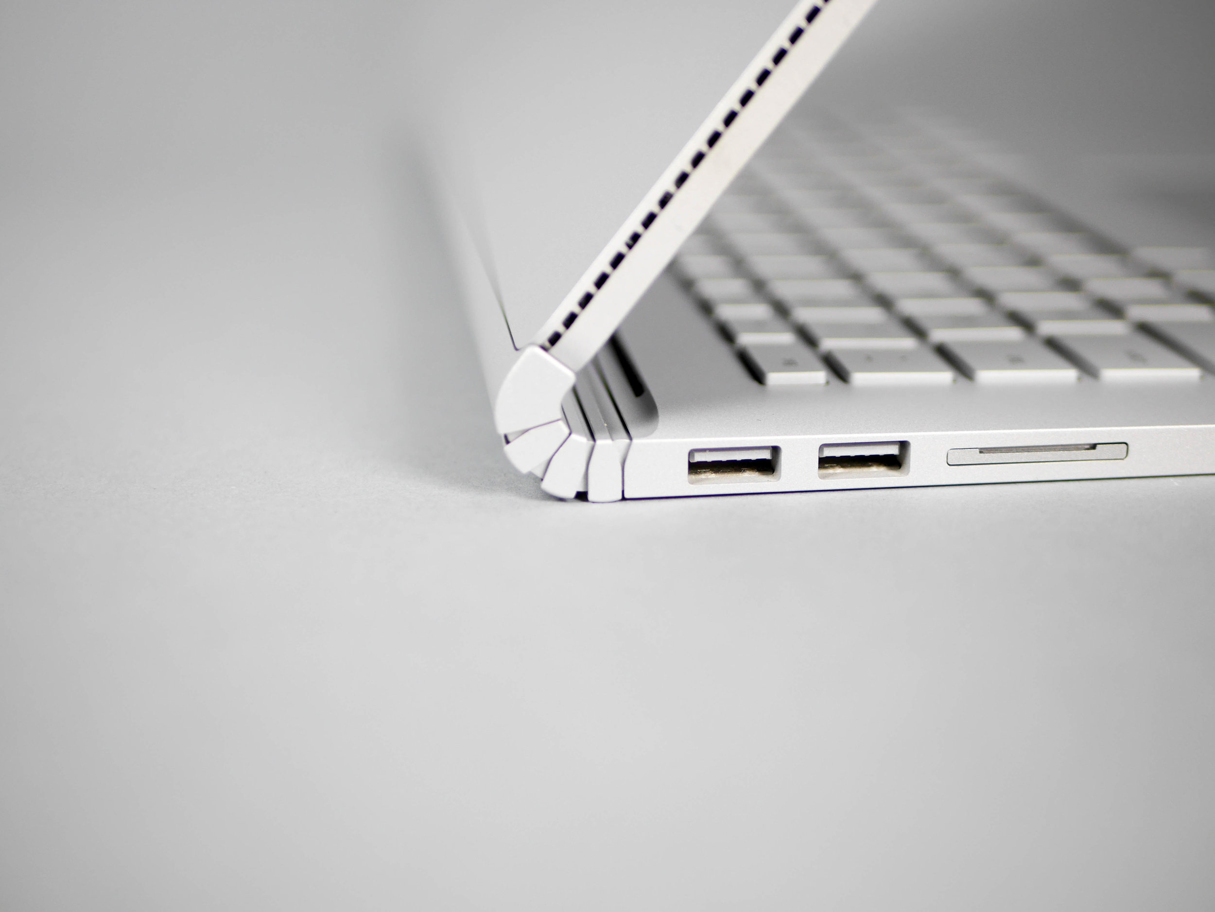
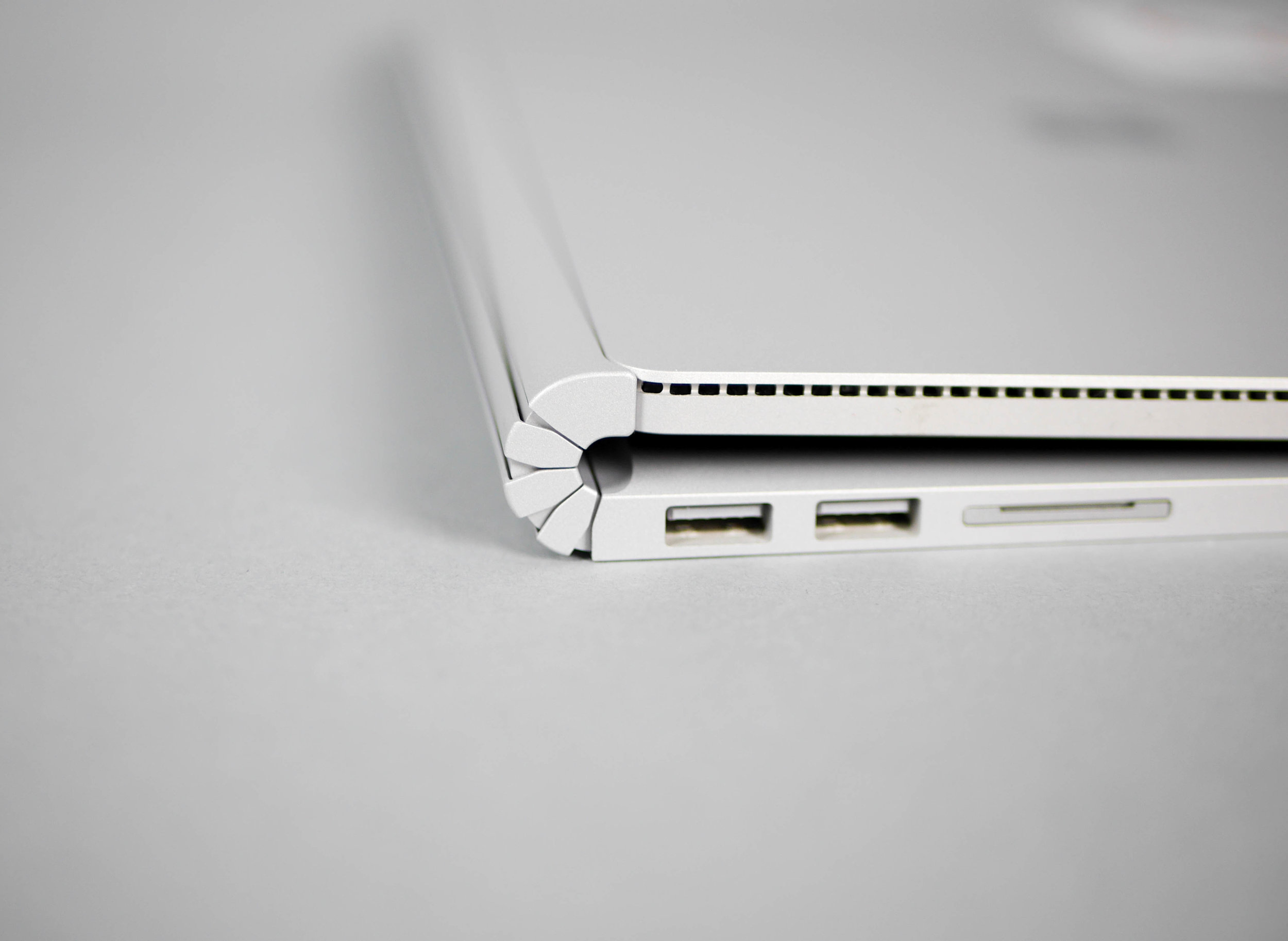
From the left side view we can see two USB ports and an SD card slot. They have been nicely arranged to follow the slight taper of the keyboard bases thickness towards the opposite edge of the screen. Maybe it's the gray background but this view also made me think about what the Surface book would look like with some contrasting color on the hinges or the top/screen portion and how this might communicate the articulation of the hinge or that the top portion is a separate part of the base even more.
Maybe something like this.
To help highlight how the hinge articulates, here is a collage of a few snapshots of its motion. Unlike most hinges which open at a single point of rotation, the Surface Book hinge rotates and extends the length of the base, helping to support the heavier top half. This hinge moves kind of like a watch band but it much more rigid, capable of holding shape in any stage of movement. The hinge very honestly communicates how it works and it continues to show you every time you use it. The Surface Book seems more familiar, alive, and dynamic because of it.
When you remove the top screen, the connections below are exposed. On each end is a mechanical support that is also part of the electo-mechanical latch that releases the screen. The middle connectors perform battery and data electrical connections between the top and the bottom. This ability to separate the top and the bottom is totally new for a laptop, and it changes the way we are used to think about and use predefined software and hardware. The built in flexibility isn't always needed but when you can make use of it, it really makes its worth apparent.
There is one region on the front where the hard edge is interrupted and is changed to a beautiful gradual chamfer. This is to help you open the Surface Book but the strong magnetic closure and the lightness of the base still makes it a bit awkward to open. Having a big chamfer like this catches a lot of light or shadow during different lighting conditions and this contrast helps to draw some hierarchy to this feature.
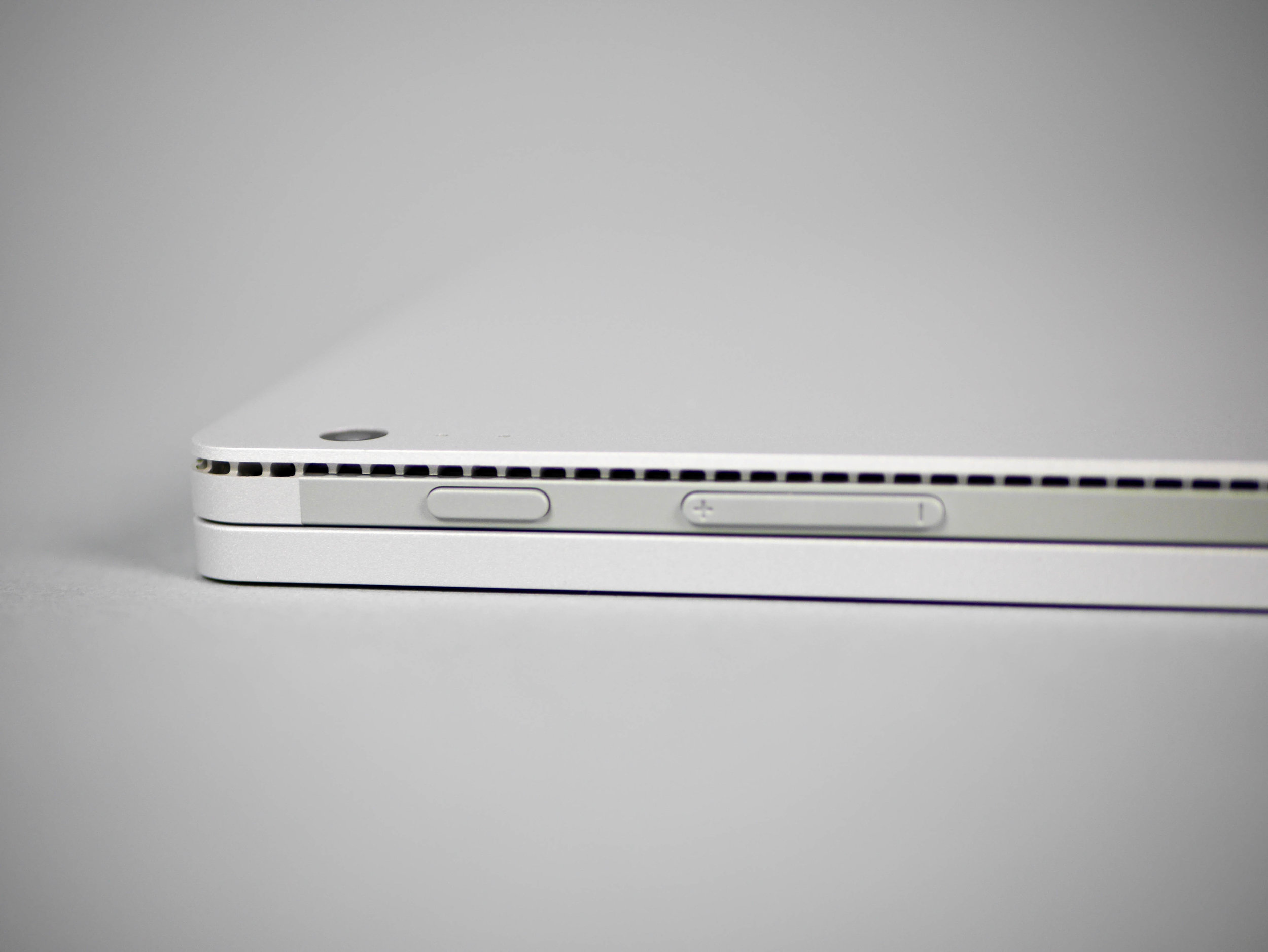
This view shows an interesting aesthetic that is used on all vents within the Surface brand language. It seems to be drilled holes from the inside followed by a cut with a rounded tip straight bit from the outside that goes around the length of the vent area and meets these holes half way. This treatment adds an element of precision and precise automation needed to successfully craft each vent.
The power button, volume rocker, and plastic panel below them are some of the only exterior plastic parts visible on the Surface Book and there's a good chance that there might be a internal Wifi antenna making use of this radio frequency transparent material. This picture also shows how little of a gap there is on the front which is the main reason the chamfered affordance near the mouse pad is so useful. Overall the Surface Book and especially the hinges creates a computer that seems totally unique. Its pretty shocking that some careful attention and innovation to an otherwise mundane and forgettable part of every laptop, the hinge, adds so much to the experience of using the Surface Book. The ID team at Microsoft has done a fantastic job designing a laptop that adds so much functionality and flexibility compared to its Macbook competitor. I'm really excited to continue following the Surface team at Microsoft which seems to be focusing so much on creating compelling hardware for creative professionals. Just like they did with the hinge, I can imagine Microsoft's ID team questioning and taking a closer look at other basic parts of the laptop and polishing them into more usable and tactile versions, eventually evolving the laptop piece by piece.
