Roku : Roku 3
Review by Gerry Mayer

The Roku 3 was released in 2014 as a new way to watch TV, providing easy access to several video steaming services without needing a connection to traditional cable TV. The Roku 3 is everything a cable box isn't since it's small, simple, and well designed. Right off the bat, let's talk about the purple logo tags. I think they're genius because not only do they make the brand more tangible and recognizable, but they associate with other tagged objects we own like clothes and luggage. In this way, the Roku 3 feels more personal and familiar, like we already own it. Since the same tag is on both the box and the remote, they also help less tech interested people understand which remote goes with which box in a really easy way.

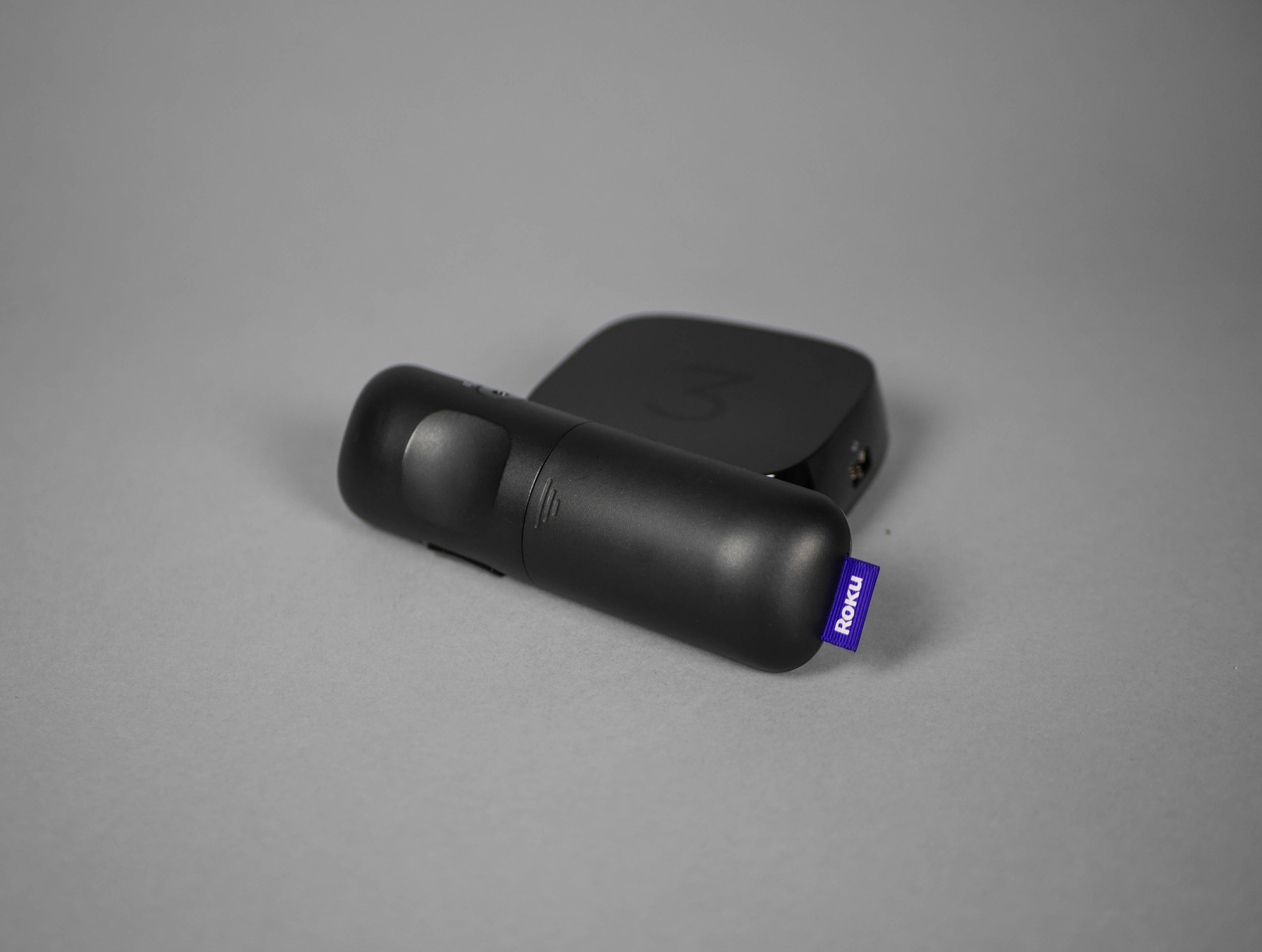
Designing a set top box isn't easy because there aren't many tangible functions to design around, all it needs are some ports on the back and a flat bottom. Keeping that in mind, Roku has done a nice job with the form, keeping it similar enough to the competition (Apple TV) to understand what it is, but distinguishing it with tapered sides and a rounded base that gives the Roku 3 a less bulky and friendlier appearance.
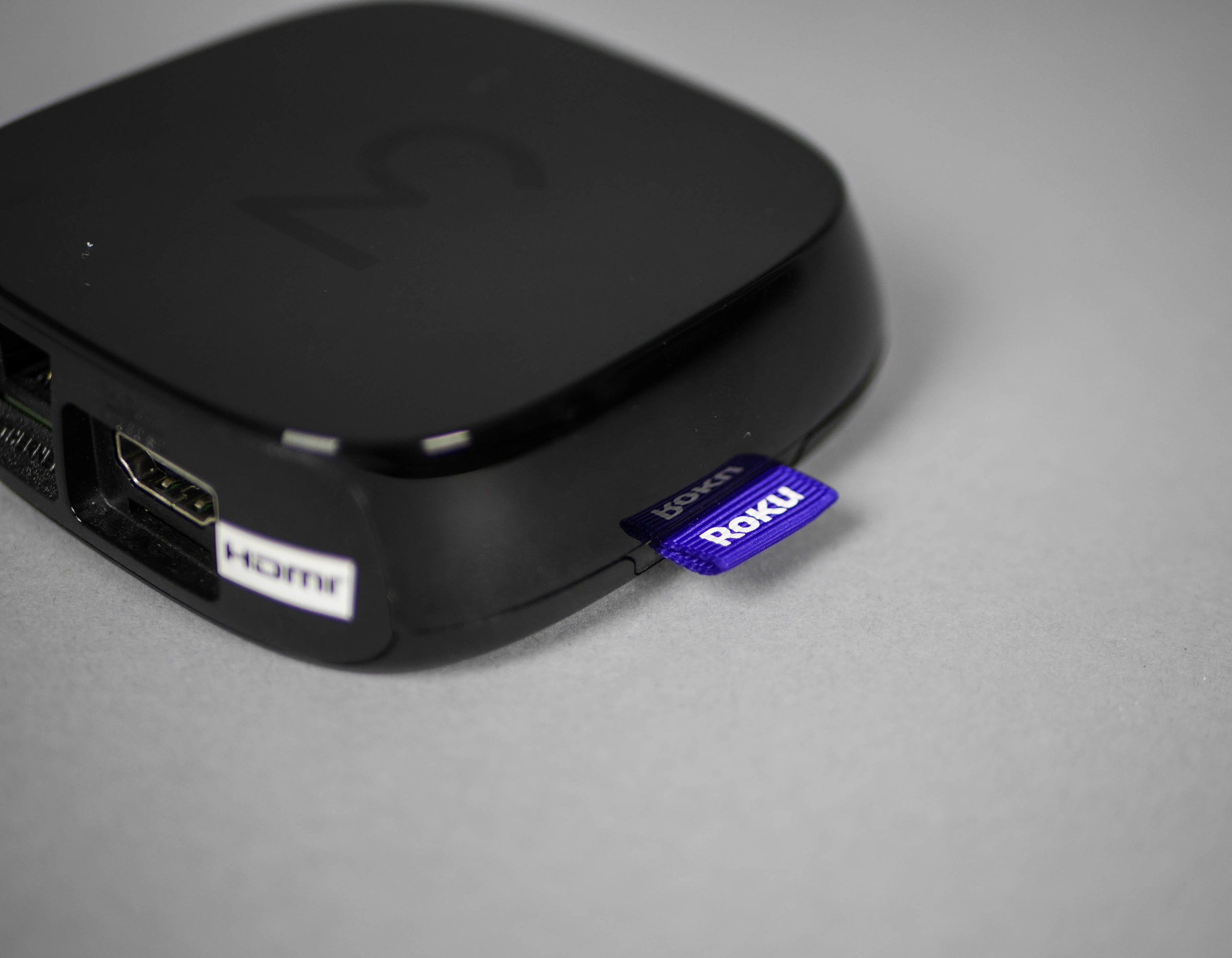
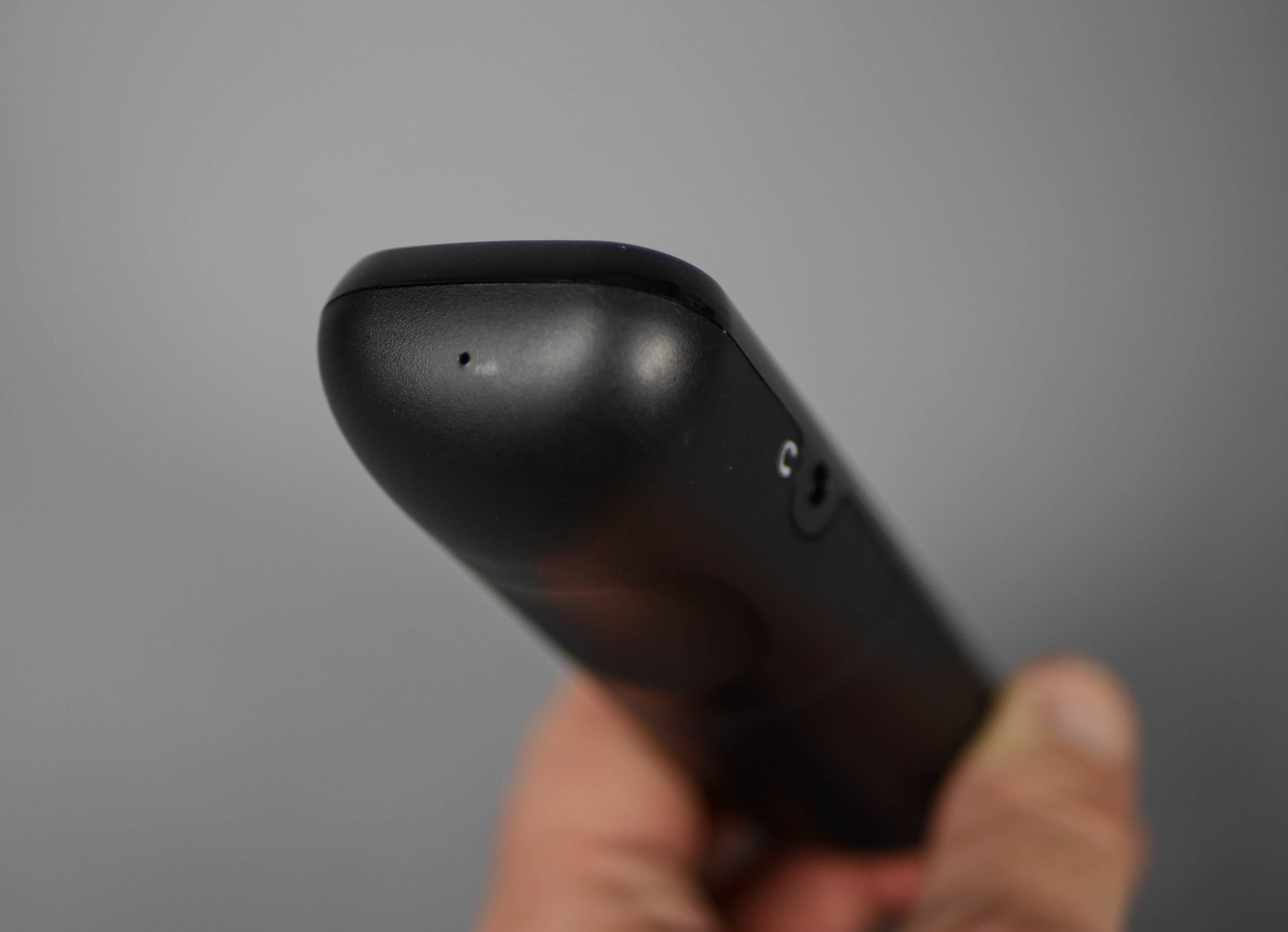
Here we get a closer look at the tag and it's interesting to see that the tag has its own hole in the case that the part line dodges around. This is important because it shows that the tag idea was there from the start, where it could have easily been sandwiched between the two case halves as an after thought. In this way, perhaps the tag was considered to be as strong a feature as any other ports on the back.

On the back we can see that all the ports are arranged at varying center lines. This was clearly a conscious decision to keep the Roku 3 as small and compact as possible instead of arranging the ports in a more visually pleasing way. It's important to point out that this separate back part is given a deeper, mold tech texture which keeps the back surface from looking as scratched since it has to stand up to the metal connectors brushing against it.

The bottom of the case has a rubber sheet fixed to the bottom that helps the very small Roku stay in place despite the pull of heavy attached cords. It was a nice touch to see the debossed FCC and product information, hiding it nicely underneath the box.

The remote is nice and compact and has a solid, hand friendly form. The layout and number of buttons seems to strike a good balance, not too many, and not too few. Having dedicated steaming service buttons makes the whole streaming process much simpler. The logos do add to the visual noise of the remote and compete with the Roku logo, but it's a fair trade off for ease of use. Also, like the tags, the use of purple helps to highlight the most frequently used and important buttons.
The bottom of the remote control has a nice affordance for the pointer finger, helping to instruct a specific pose for your hand that helps the designers control the experience more tightly to place the buttons according to this pose.
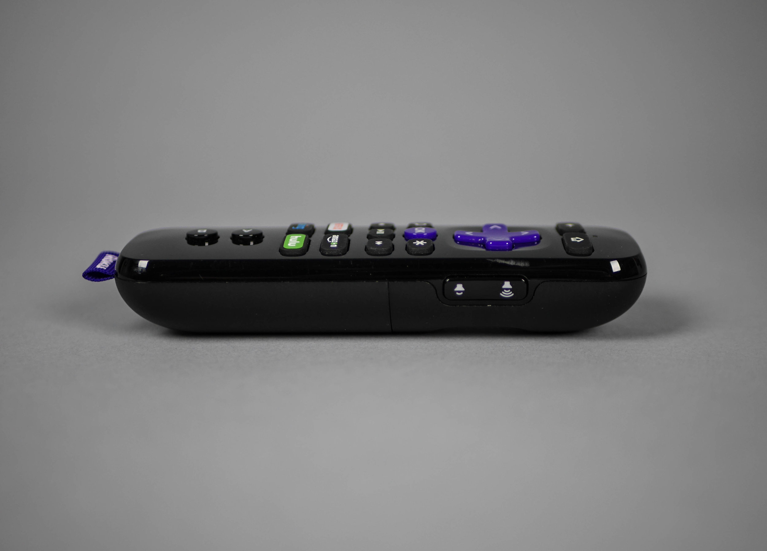
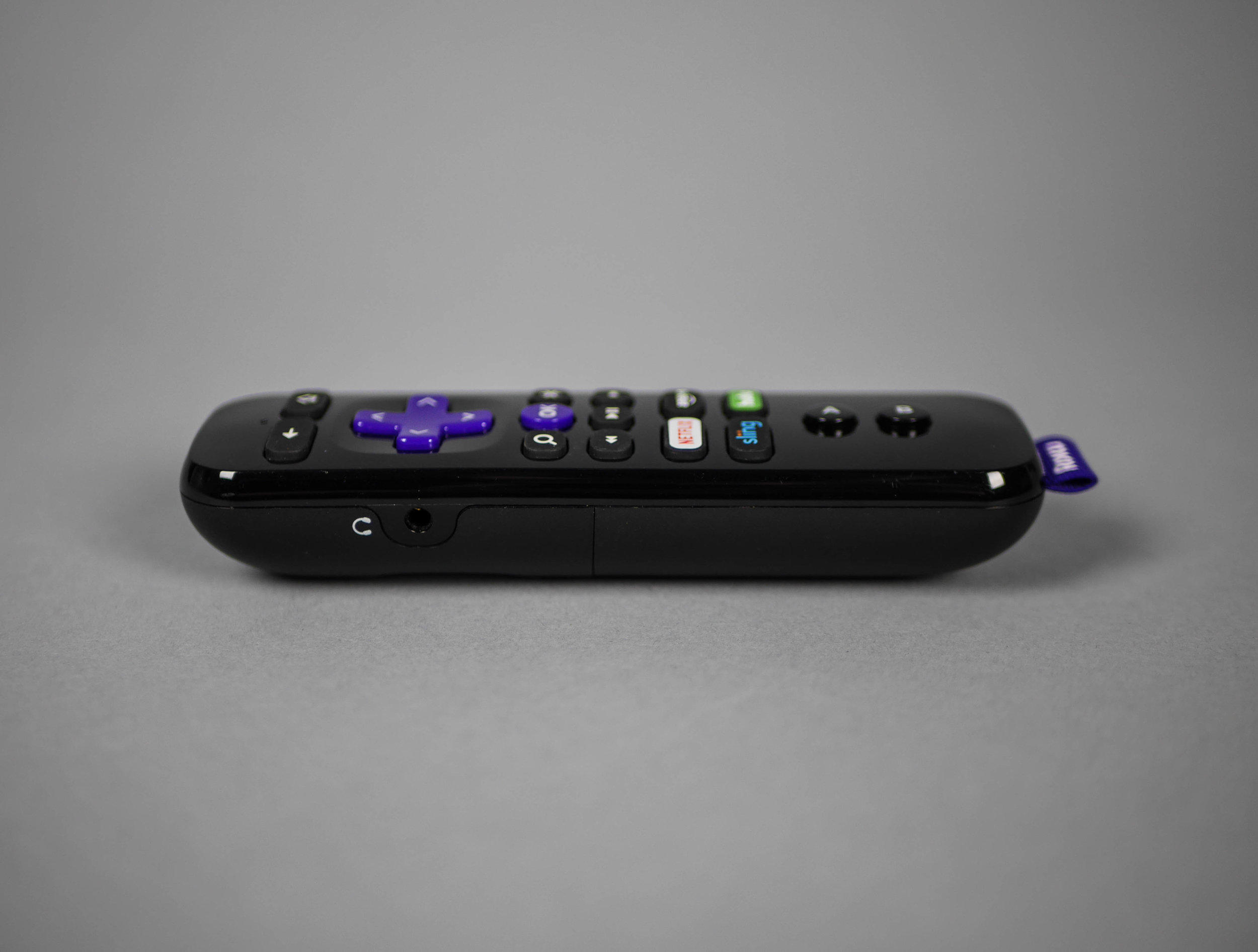
On the side of the remote there are some audio buttons that are specifically used for a headphone jack that lets you listen to the streaming audio right from the controller. It was a nice choice to put these separate elements on the side of the remote instead of adding clutter to the main button layout.
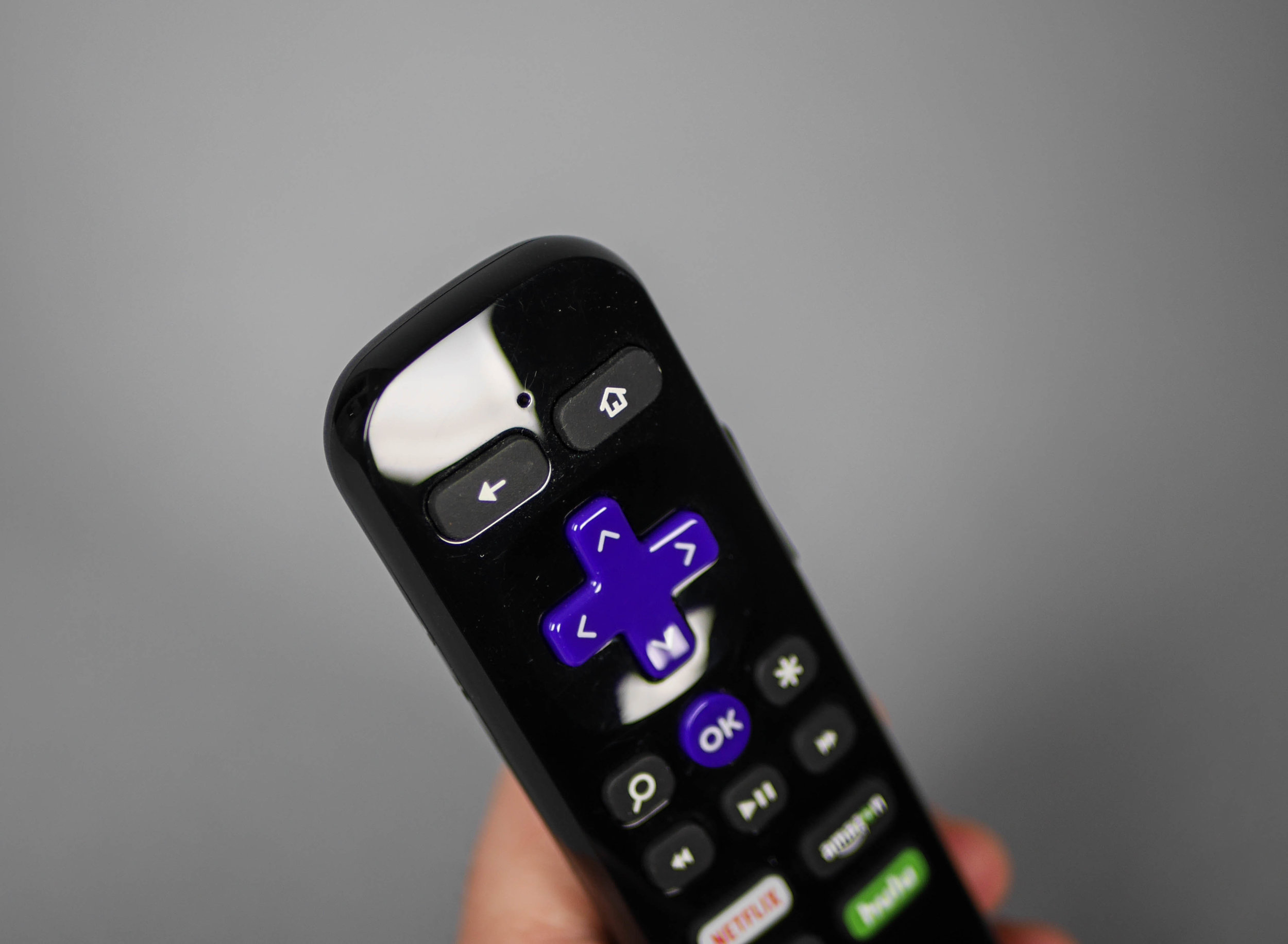
This remote also includes a search by voice feature and these two holes are for microphones in the X/Y configuration. This is nice compared to just having one microphone because it gives a much wider active pattern to speak into. Also, by placing the microphones on the front of the remote instead of at the bottom, there is a familiar, subconscious association with how you'd normally hold and speak into a handheld microphone.

This picture helps to show the button material that was used, either a silicone rubber or gloss hard plastic. This use of hard plastic might be to increase the durability of the most used buttons. This view also shows that the Roku remote can be used as a video game controller when held sideways.

Under the battery door reveals that both batteries are installed the same direction instead of having to look to see which way each battery goes. I didn't expect this since it's not very common, but this choice shows even more attention to detail. This attention to detail is a common theme seen in the Roku 3. It's a small streaming box packed with clever design choices that gives the person using it a simple to use product that makes several common technology annoyances disappear.
