
Microsoft : Xbox One Controller
Review by Gerry Mayer

The Xbox One controller by Microsoft is one of the finest video game controllers to date, with a rumored $100 million dollars of research and development budget behind it. Having owned a Xbox and Xbox 360 I was really excited to see the next iteration of the Xbox controller and the industrial design team behind it did not disappoint. The Xbox One controller is much more refined and elegant than the Xbox 360 controller which was much round and friendly.

One of the most novel refinements is the placement of part lines. They're in perfect places, away from where your finger tips rest so you don't feel them. This and the thickness of the plastic makes the controller feel much more solid.

On the back of the controller, the part line placement is more visible and it falls about half way between the middle of your finger and the fingertip so you don't have much pressure on the part line. This picture also gives a view of the battery door which is nicely labeled with an eject icon which has been molded into the plastic part using a contrasting gloss texture. Also the more angular styling can be seen on the ends of the controller grips where they come to a subtle point near the part line.
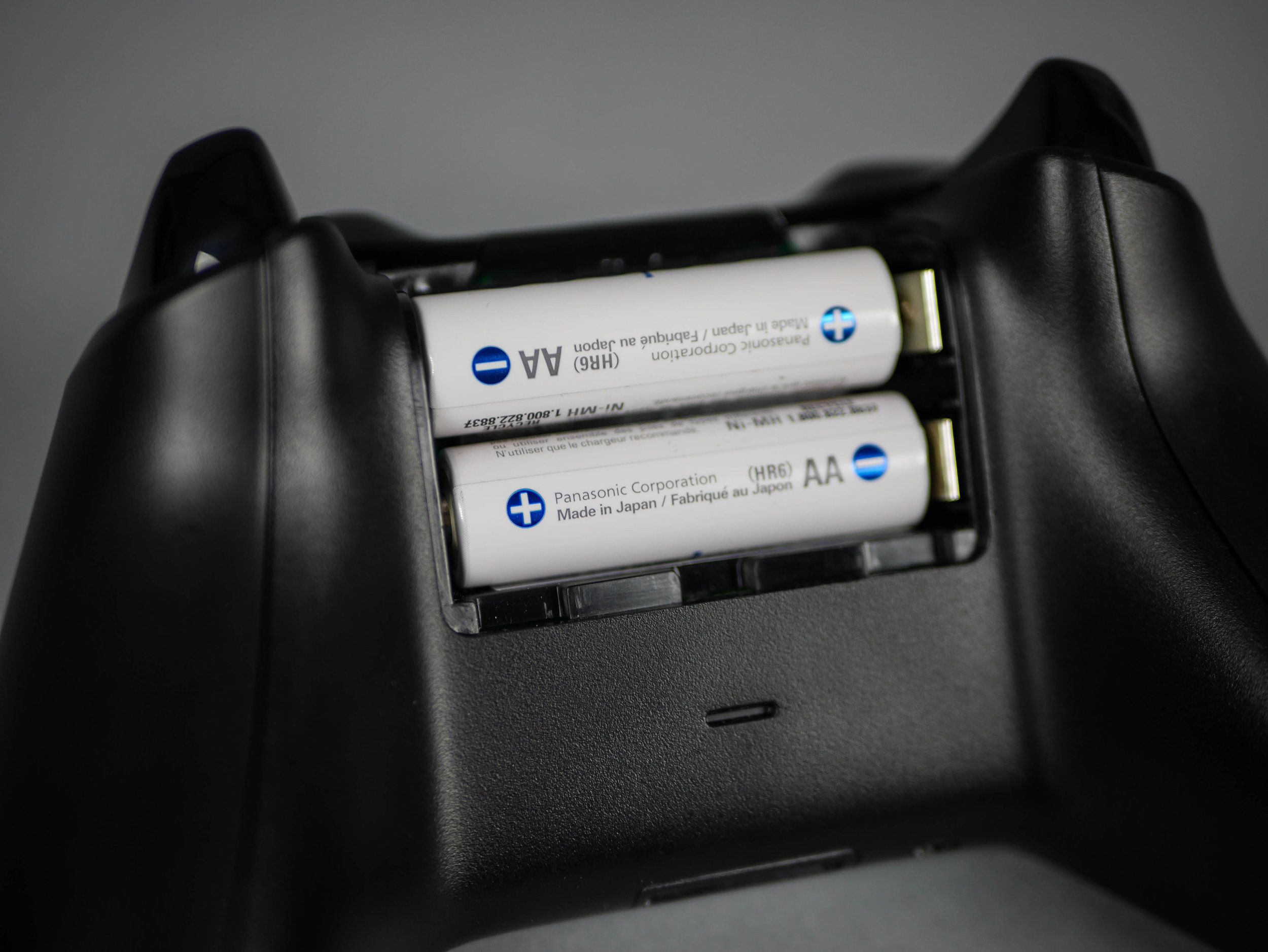
The battery door pops off easily when the eject symbol icon is pressed revealing a two AA batteries that are easy to remove thanks to the partially open cavity towards the top of the controller.

The Xbox One controller makes good use of mold tech texture to provide contrasting shades of black. The lightly textured body reads lighter because of the reflected light off of the texture and the gloss portions of the triggers and buttons reads as the darkest value. The Xbox button with the Xbox logo is backlit which helps to deliver wireless syncing information and contrasts very nicely with the deep gloss black surrounding it.
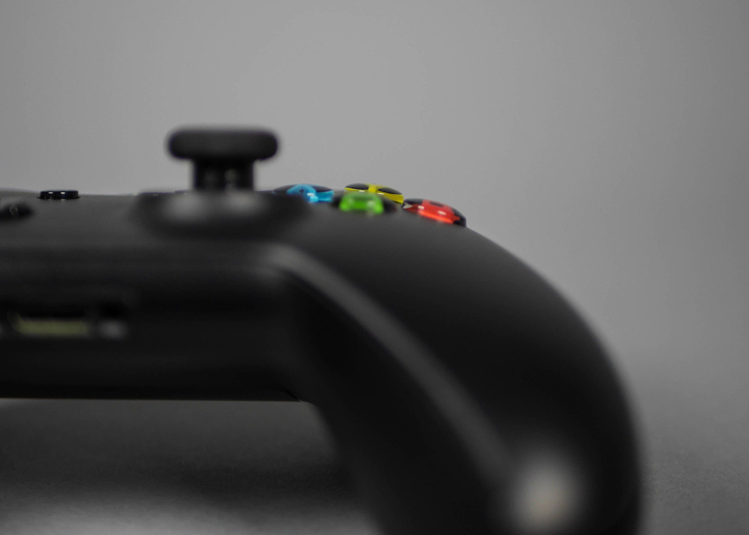
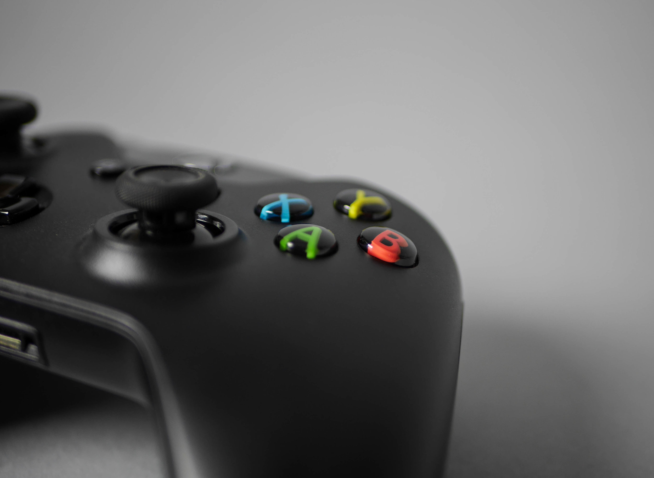
The ABXY buttons are very interesting, with multicolored letters floating in a clear dome with a black back. This give the appearance that the letters are floating and the black background matches the rest of the gloss black plastic on the controller.

The triggers are nicely contoured to your the bends in your finger and overall the ergonomics are much more natural with the angled placement of the two triggers. Pressing these triggers feels extremely solid and it seems like each trigger bottoms out on a rubber coated part since it doesn't make a plasticy clicking sound.

The design team avoided using pad printed for logos or symbols on the controller and instead incorporated the branding and labels into the buttons and parts. This can be seen on the Xbox logo on the bottom of the controller and the labels for the controller sync button above it.
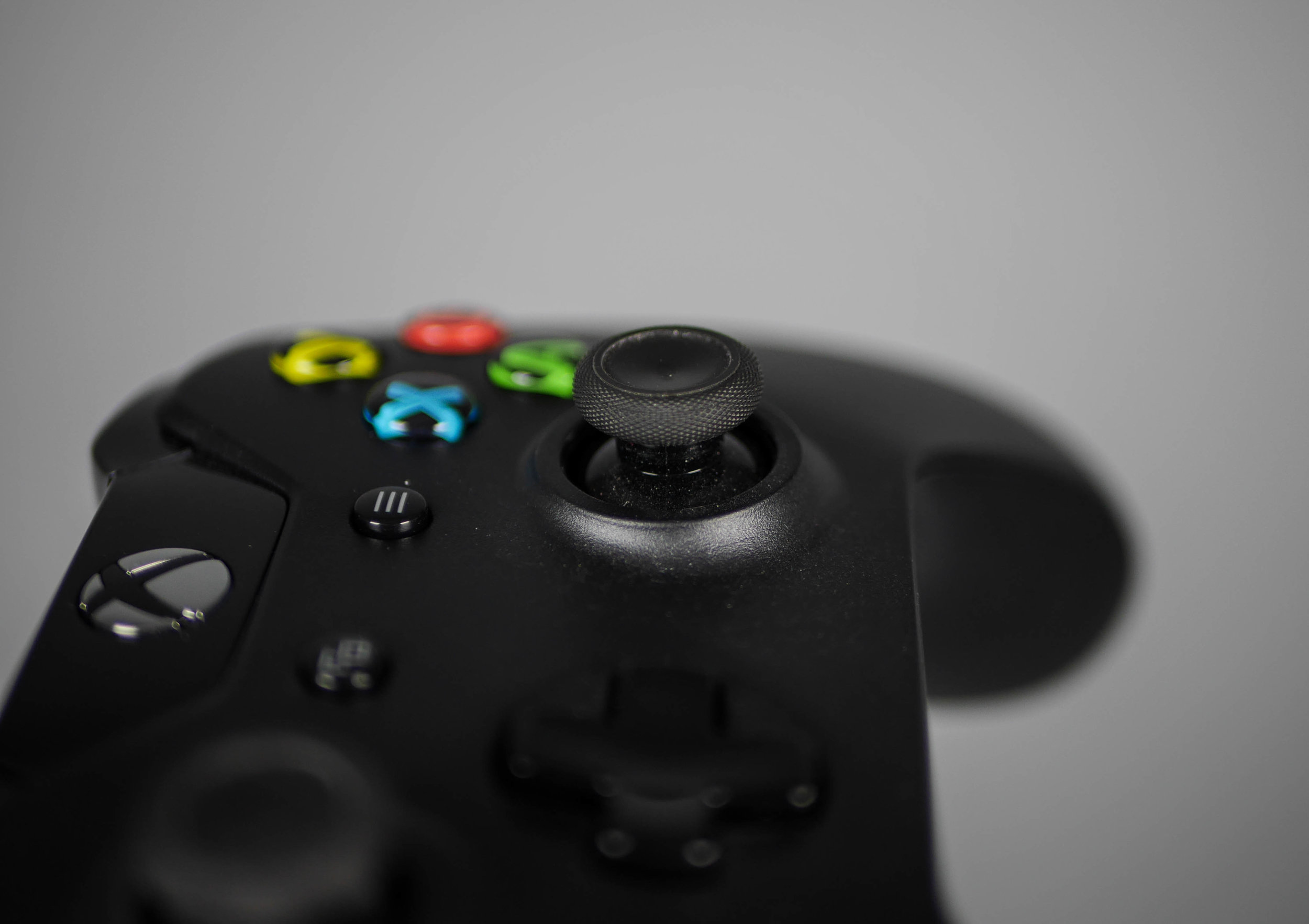
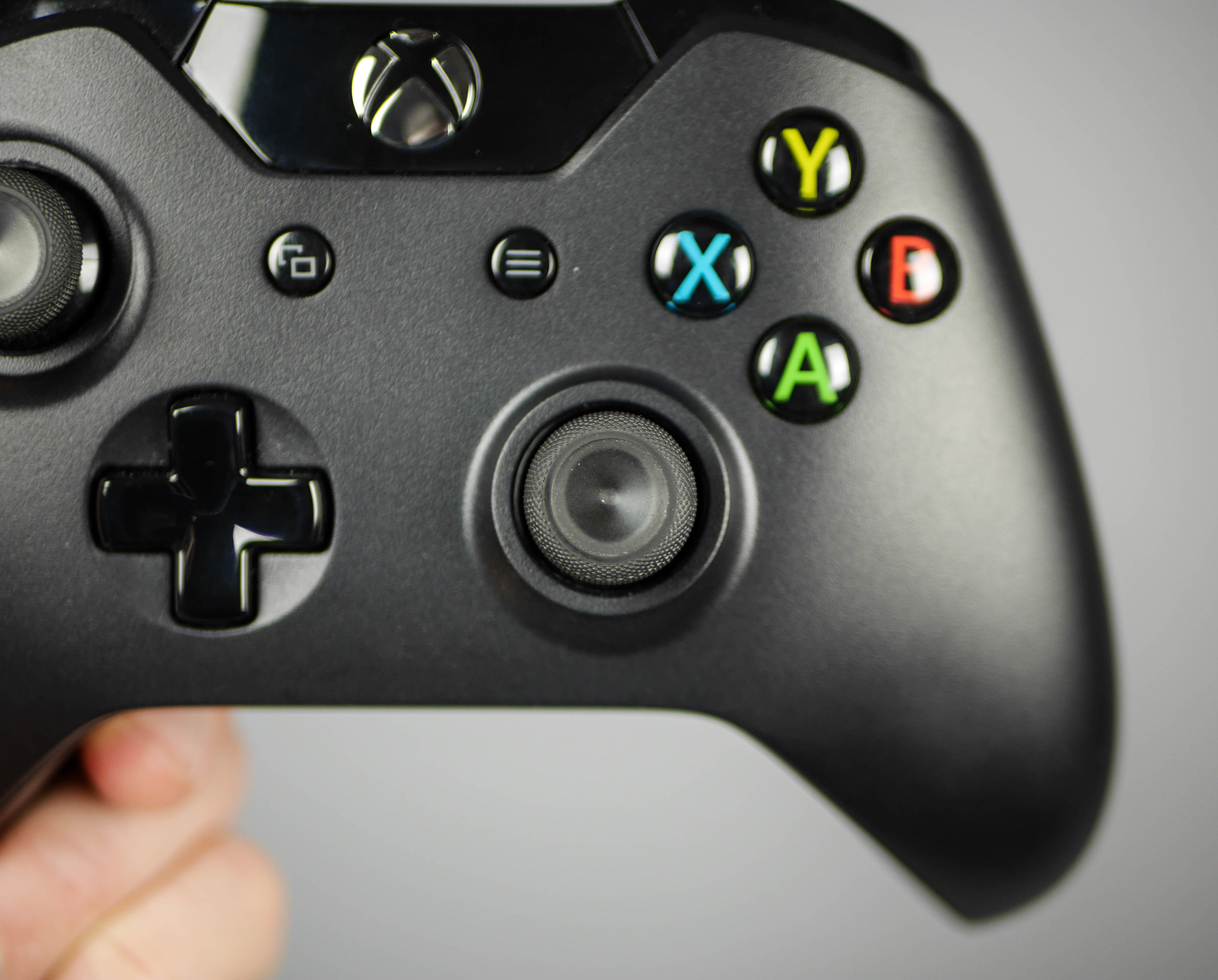

The thumb stick has been much improved and a totally different approach than the 360 controller was used in its design, instead of a dish form, sharp angles and features are used. On the outside there is this fine knurling texture that creates small points perhaps to sink into the ridges of your finger print. In the center there is a sharp lip that transitions into an angled countersink that helps to center your thumb. This sharp edge is a good balance between being too sharp and too shallow to be helpful and it feels comfortable. It seems like every time the industrial design team at Microsoft works on a new controller there's a significant leap forward in refinement and details while keeping the same overall layout. This kind of makes me think of the car industry, where most of the function is the same and it's up to the designers to add clever improvements and detail to keep each controller feeling new and futuristic. In this way it's always exciting to see what new advancements they come up with!