
Nintendo : Gamecube
Review by Gerry Mayer

The Gamecube by Nintendo was released in 2001 as a home video game console and successor to the Nintendo 64. This was Nintendo's first system that used optical discs instead of cartridges that were smaller than a CD or DVD with a diameter of 3.14 inches. This smaller disc allowed the console to be very small and compact. Nintendo even built a handle into the back which is more of a symbol of portability rather than something that was added for it's function alone.

The simple form of the Gamecube allowed Nintendo to create a smaller looking console compared to the larger but thinner, rectangular Xbox and Playstation 2 competitors. From the proportions to the original purple color, the Gamecube is very friendly and approachable, and maybe even more childish that it's competitors. There is a nice balance to the arrangement of ports and buttons on the top and front faces of the console, everything has its place and purpose without being crowded.

The back of the Gamecube is not quite as balanced as the other sides with uneven part line widths and ports that are places on the right half. The vertical part lines seem to be angled according to the amount of draft needed to release the back panel from the mold.
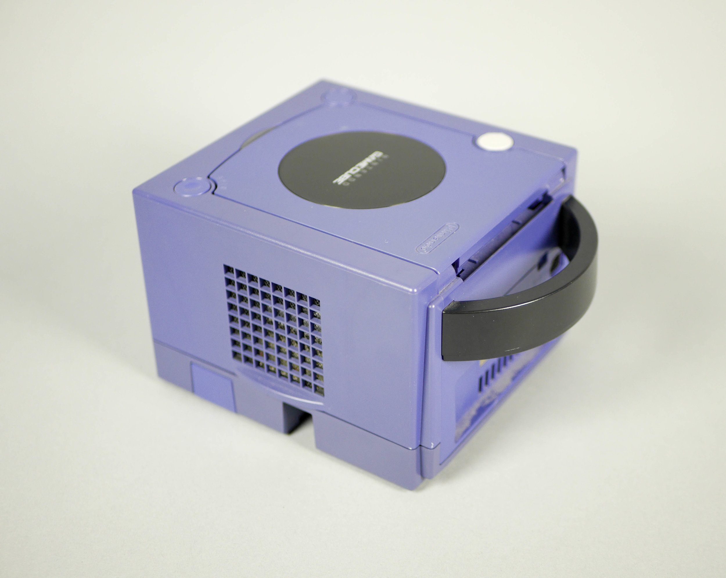
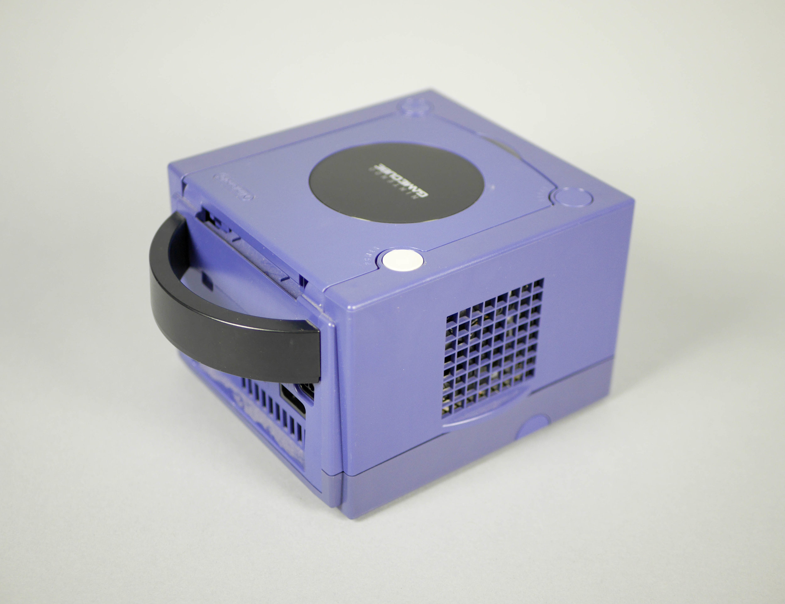
The left and right sides of the Gamecube are very even, with the same grid vent and rounded ridge at the grid's base. This ridge is probably there to make sure that anything wedged between either of the Gamecube's sides is pushed a little out of the way to leave enough of an air gap to keep the Gamecube electronics cool.

The bottom of the Gamecube shows some ports for future accessory expansion hidden behind small doors. There are nice cutouts around the tabs on these doors which make them easy to remove. One choice that is a bit strange is the rubber feet towards the bottom of the picture, but they weren't used on the back.
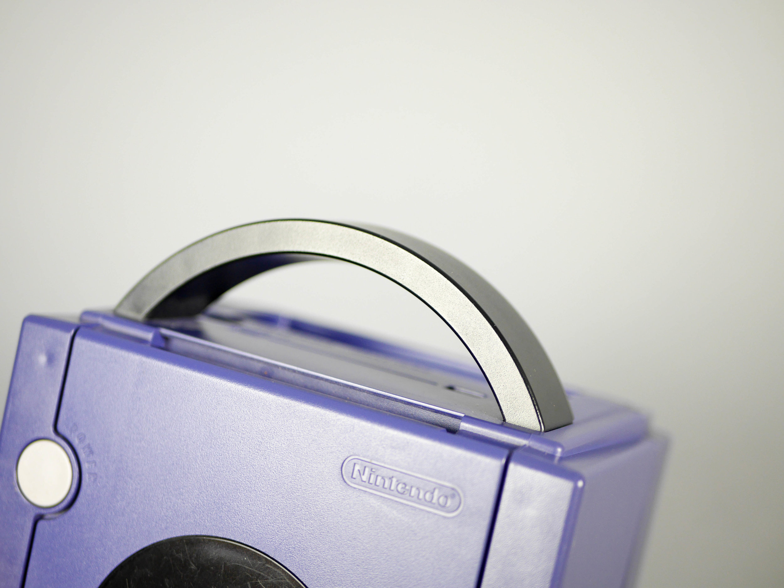
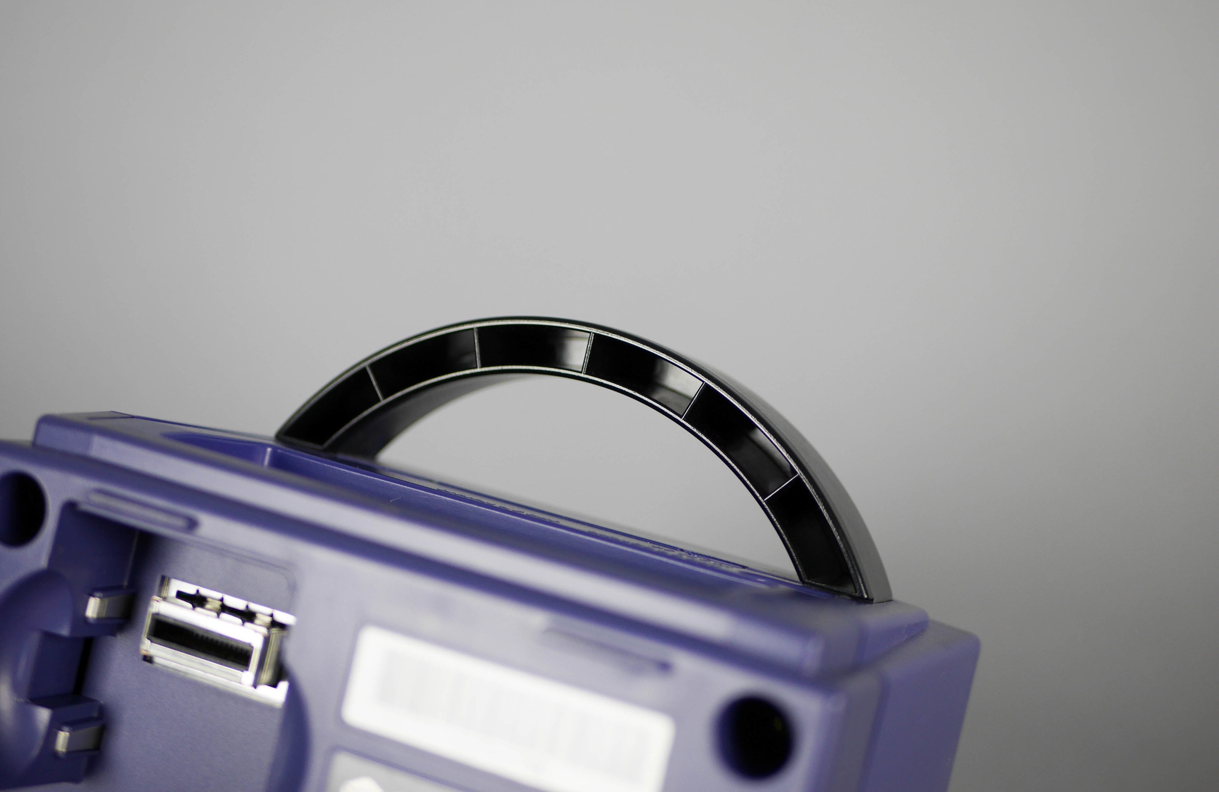
These pictures show how robust the handle looks from the left picture and how that thick part was created using thin walls and voids for the injection molding process. This left photo shows a debossed Nintendo logo, which is the second Nintendo logo on the top face of the Gamecube. I wonder why it appears both here and on the black "Nintendo Gamecube" part over the disc.

One interesting detail is seen on the open button, it's given a dimple so it's easy to feel which button will open the disc door. The other two buttons are flat because their function is to turn the power on, or to reset the console.

Here we can see how small the disc is, it only takes up about half of the Gamecube's width. It's interesting that the whole interior is the same purple but I wonder if it would have been more interesting if the inside of the disc drive was a contrasting color like black or grey. This would have been a safe place to have a color change.
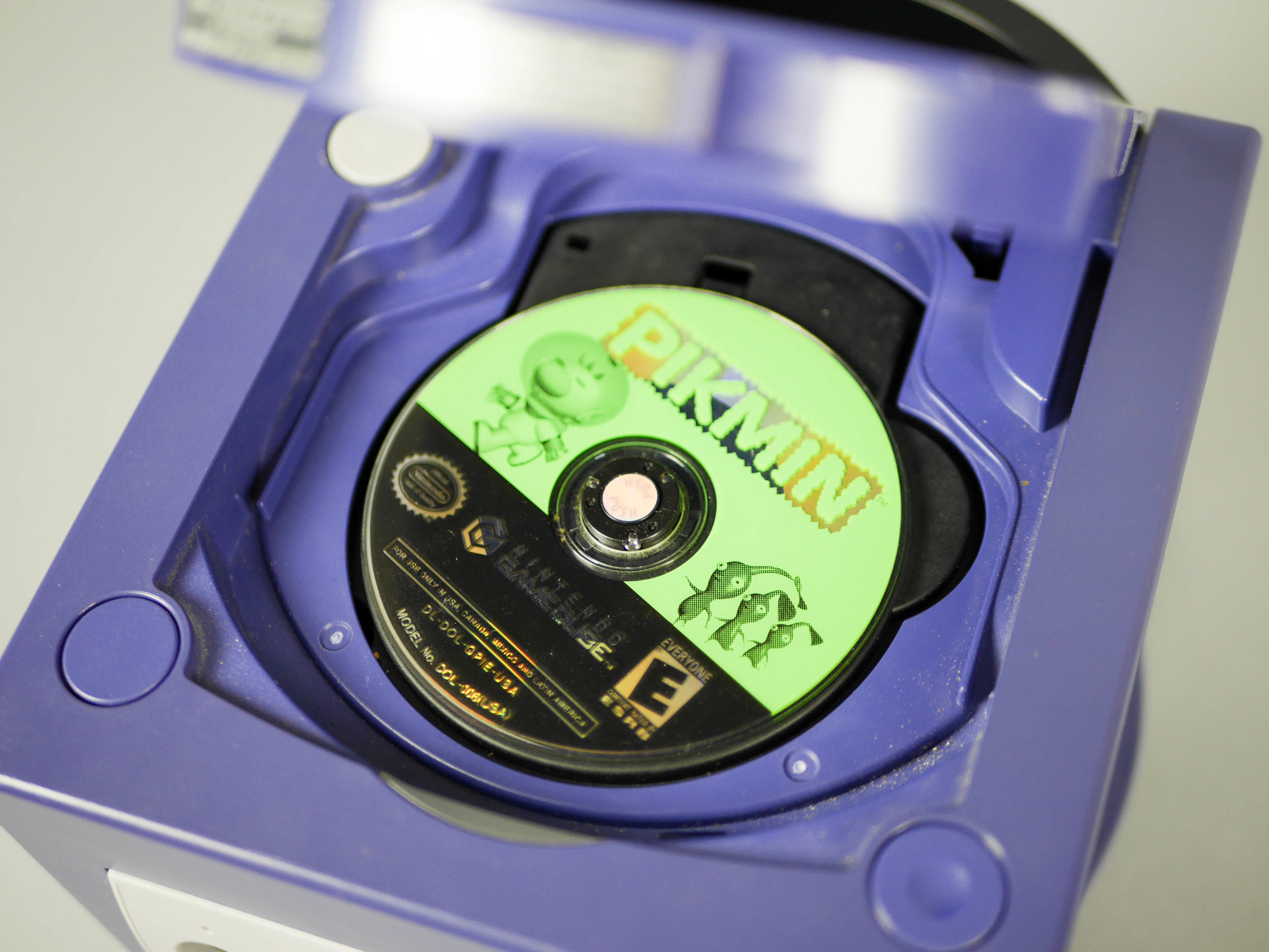
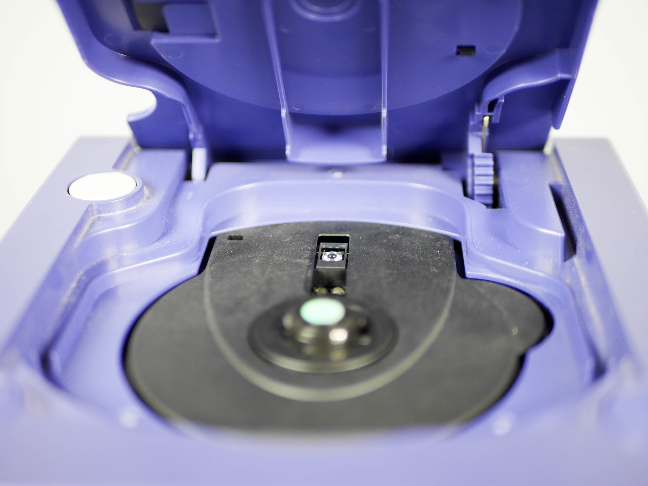
The disc can be easily removed by pressing the holographic button in the center of the disc drive. The vents needed for injection molding can be seen inside this disc drive. This was a nice place to hide them to they aren't visible when the disc drive door is closed. Another nice choice was to place the disc drive laser towards the back, near the door hinge, which would keep this sensitive component away from accidental bumps.
Analyzing the Gamecube leaves some questions but in general it is a nicely designed product that reveals some clever manufacturing and engineering decisions. Overall, the Nintendo Gamecube has a quirky design that seems fun and playful even when it's not on.
