Teenage Engineering : OP-1 Synthesizer
Review by Gerry Mayer
The OP-1 is a stunning work of industrial design and is the crown jewel of my humble synthesizer collection. It's also one of my favorite designed objects because each part is beautiful and unique, down to the finest surfacing detail on each knob, key, and switch. The designers poured a lot of love into this tiny synth and it's a joy take it with you on your musical adventures.
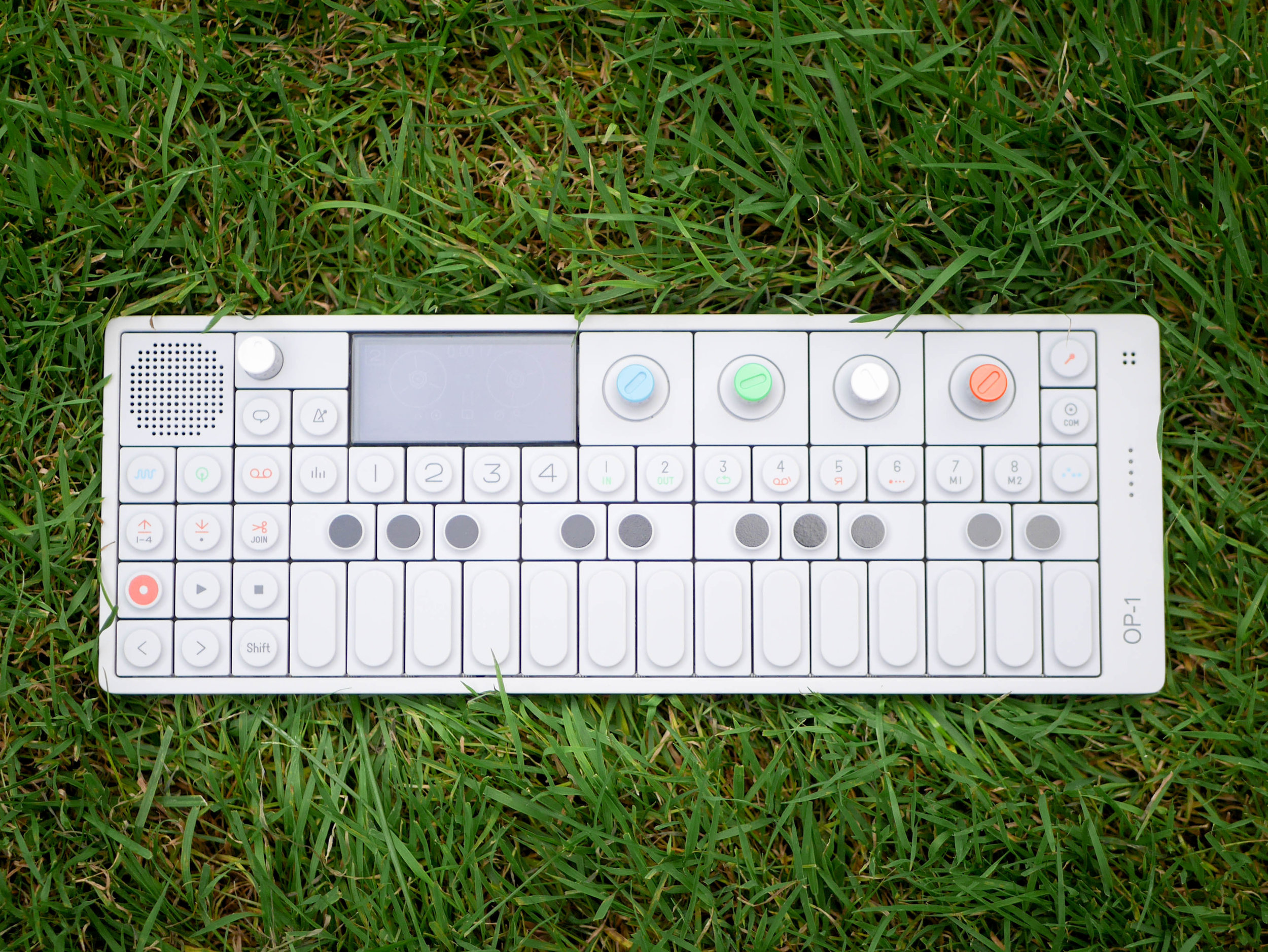
At first glance, the OP-1 first reads as a very simple and clean design where all the smaller parts are made less visually distracting by sticking to an cool light grey color across the outer housing, keys, and knobs. To me, this choice of color does two main things. One is that it sets it apart from the woody, dark, and metallic field of other synthesizer competitors. Another is that it also means that the normally white keyboard keys can use this light grey without having to add a separate color tone to the palette. This lets the other contrasting colors pop and makes the important controls easy to find.
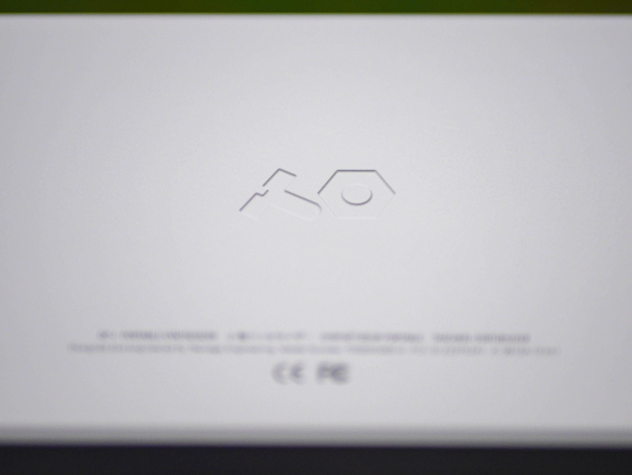
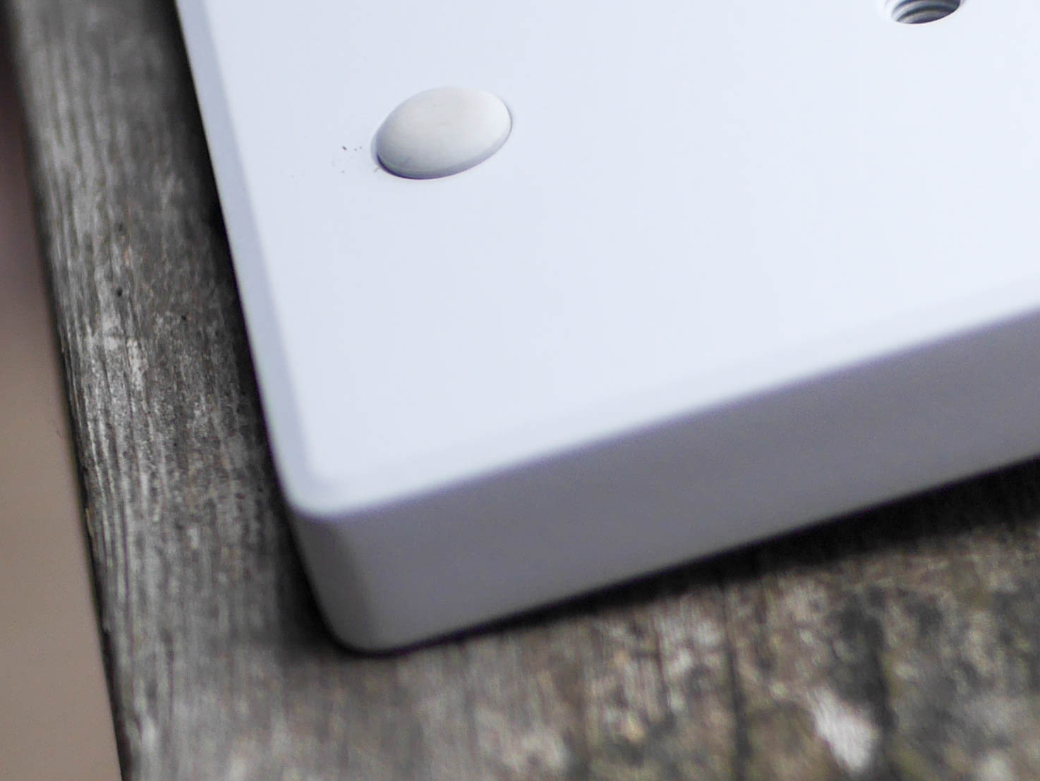
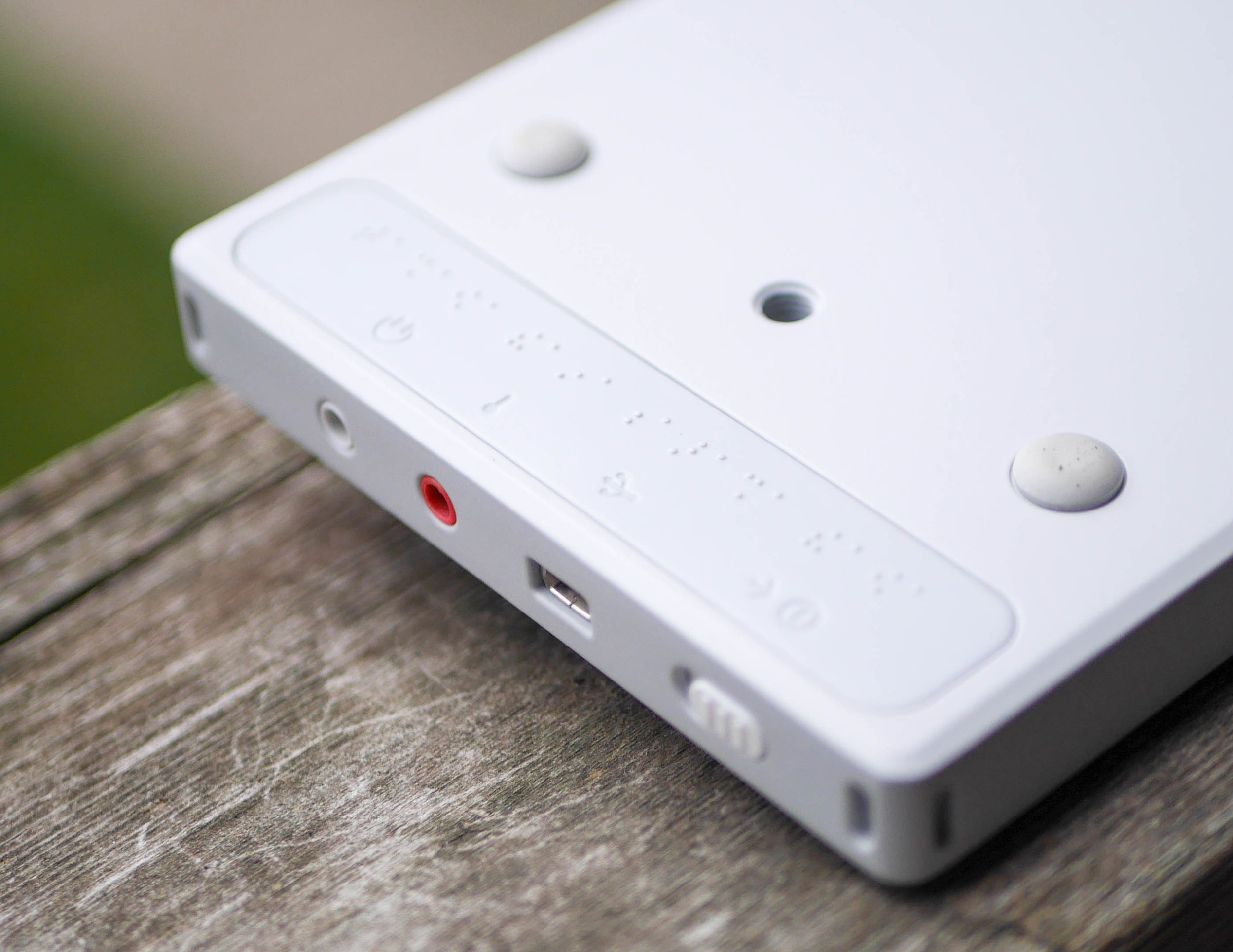
The outer case of the OP-1 is made from rather thick CNC machined aluminum which feels smooth and rock solid. Some surfacing details to note are friendly rounded corners, a debossed Teenage Engineering logo on the back, and a shallow chamfer along the bottom edge that along with four rubber feet help to give it a base shadow, helping it appear to float off the table.
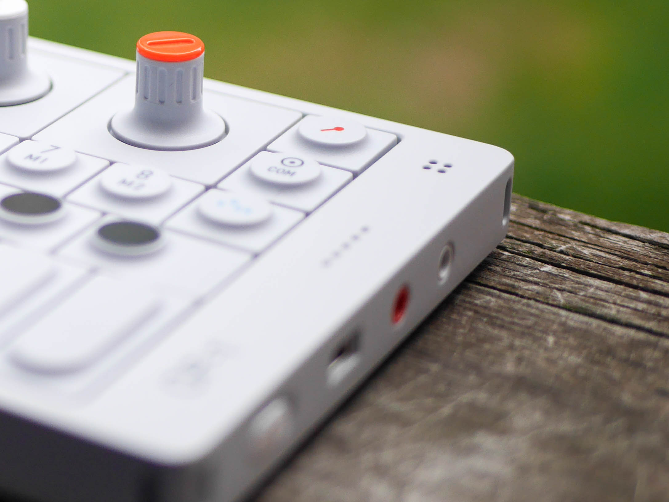
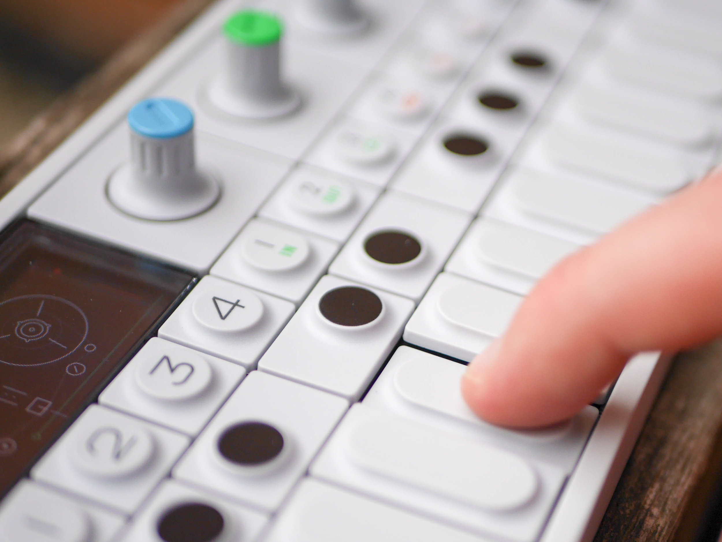
The four main control knobs have multi-colored tops that match the color of different on screen synth parameters they affect. This clever idea allowed the designers to make use of only four knobs while having the flexibility to sculpt a ton of different sonic characteristics of the synths, drums, effects, and tape by switching the on screen graphic. The physical knobs are hard plastic with a small colored part that appears to snap on this common knob base. The feel of the knobs turning is smooth but precise where fine degree stops provide a quiet but tangible click as you turn them.
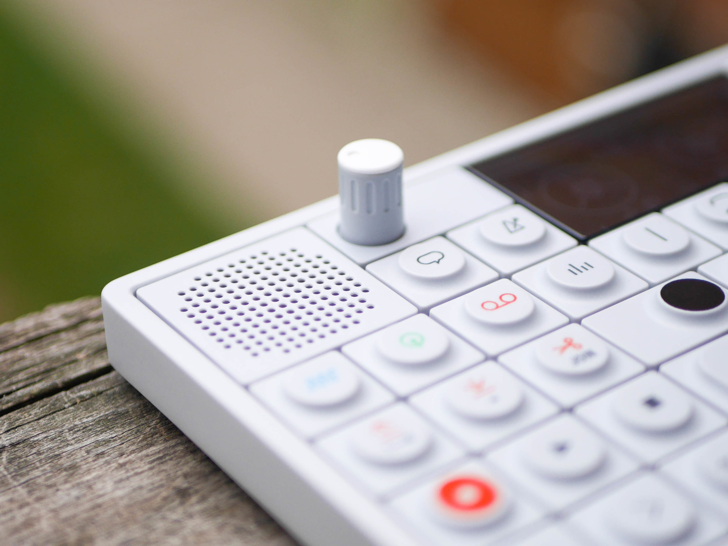
There is one more knob to control the output volume and it has the same lengthwise rounded grip cutout features that elevate the otherwise plain cylindrical form. The choice for a somewhat cylindrical pattern of holes over the speaker was likely a compromise for the durability of the part. I think a rectangular pattern extending out fully to each corner would have appeared more uniform with the rest of the styling.
All of the ports are neatly arranged on the right side of the OP-1 and the main one that stands out is the red recording jack which is helpful to make sure you plug your headphones into the right audio jack. The inclusion of the label plate on the bottom includes symbols for each item as well as their braille versions which continues the Teenage Engineering's theme of thoughtfulness by making sure the OP-1 was designed everyone to use. Additionally, the strap loop slots on the corners reinforce the idea of portability even if they aren't always used.
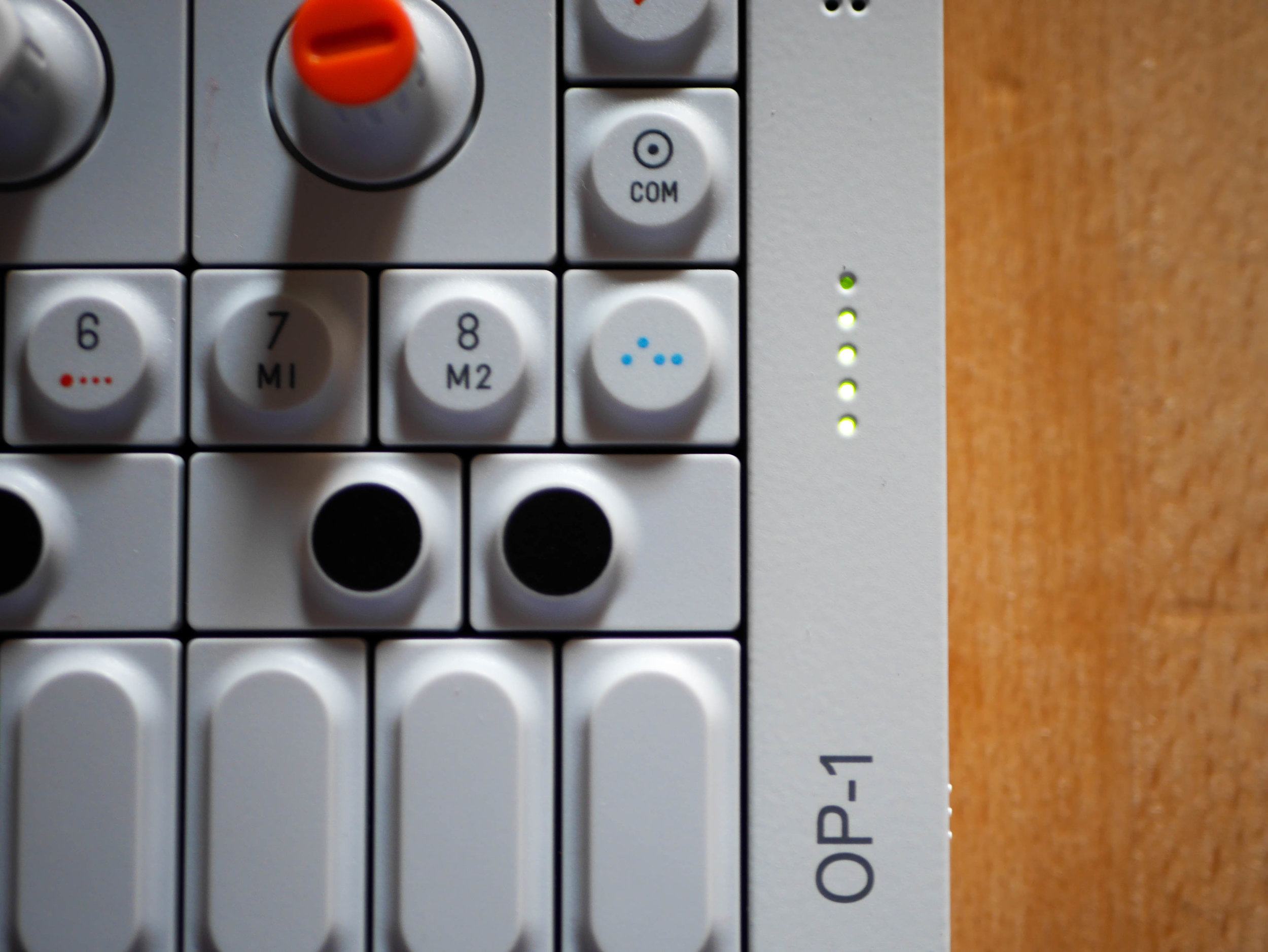
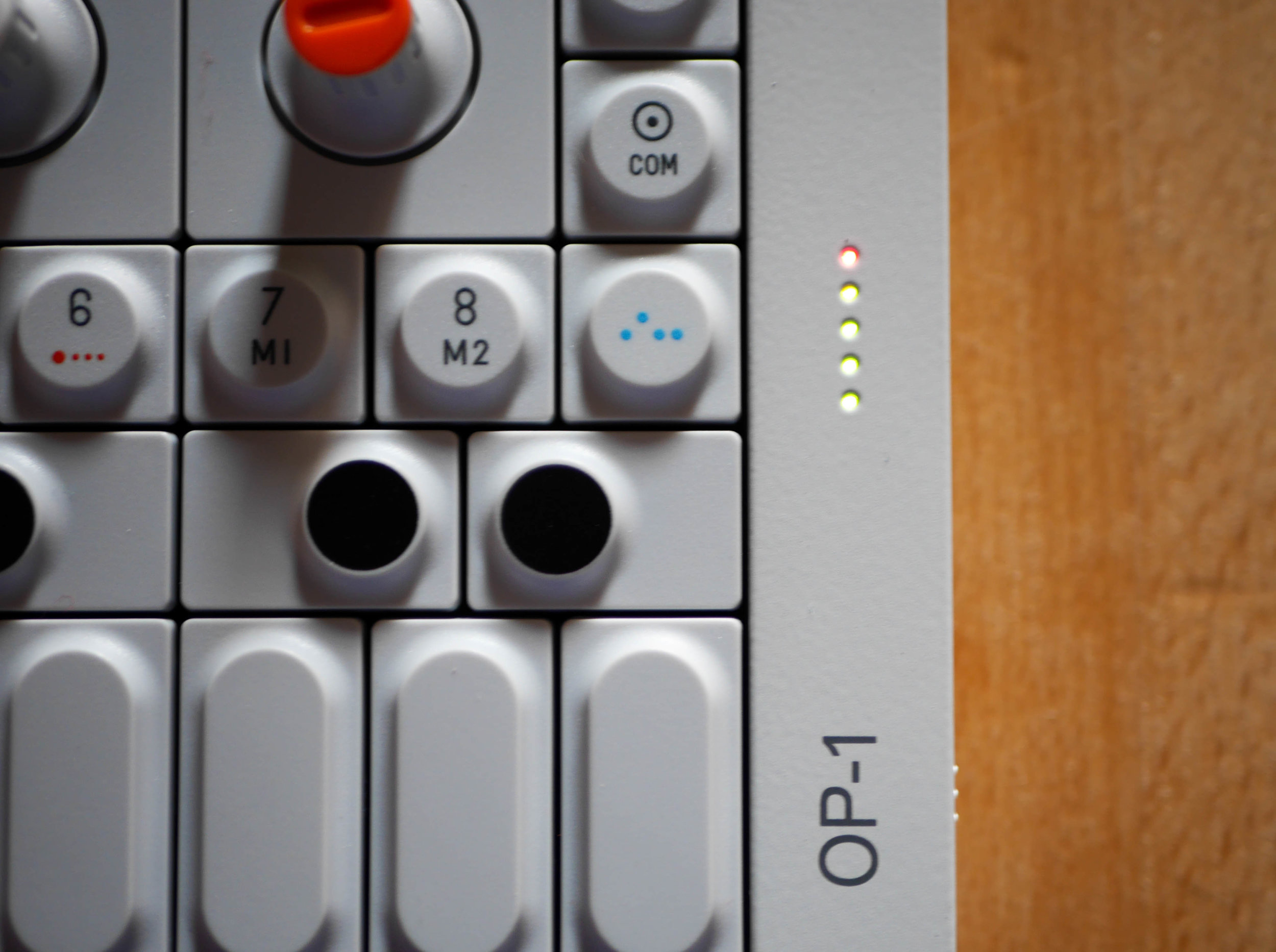
Each button and key on the OP-1 has a very interesting form where the bases are square or rectangular and the tops are circular or rounded rectangles. The square base keeps the modular looking grid styling going from edge to edge, building a top surface from a sum of all of the buttons. These smaller button tops provide affordances that help you feel the notes while playing and prevent accidental button presses. The OP-1 buttons have a familiar feeling press, one that is shared by short throw keyboard style scissor switches. They are very inviting and clicky.
The OP-1 even includes a built in output peaking meter which carefully shows then the output volume is distorting. This simple presentation is extremely handy and visually makes the OP-1 feel more alive.
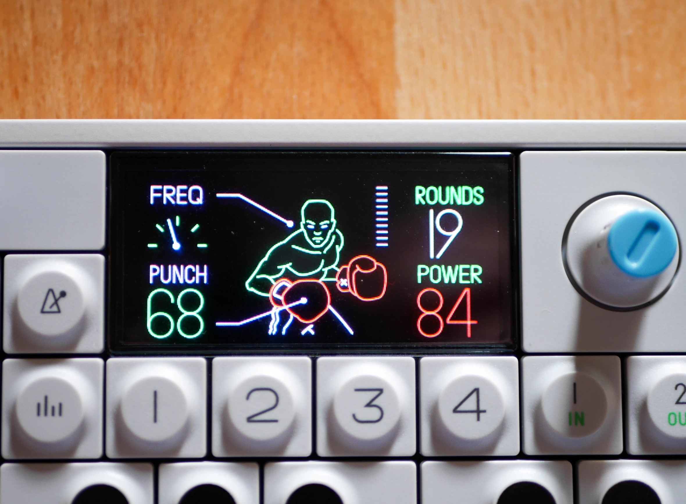
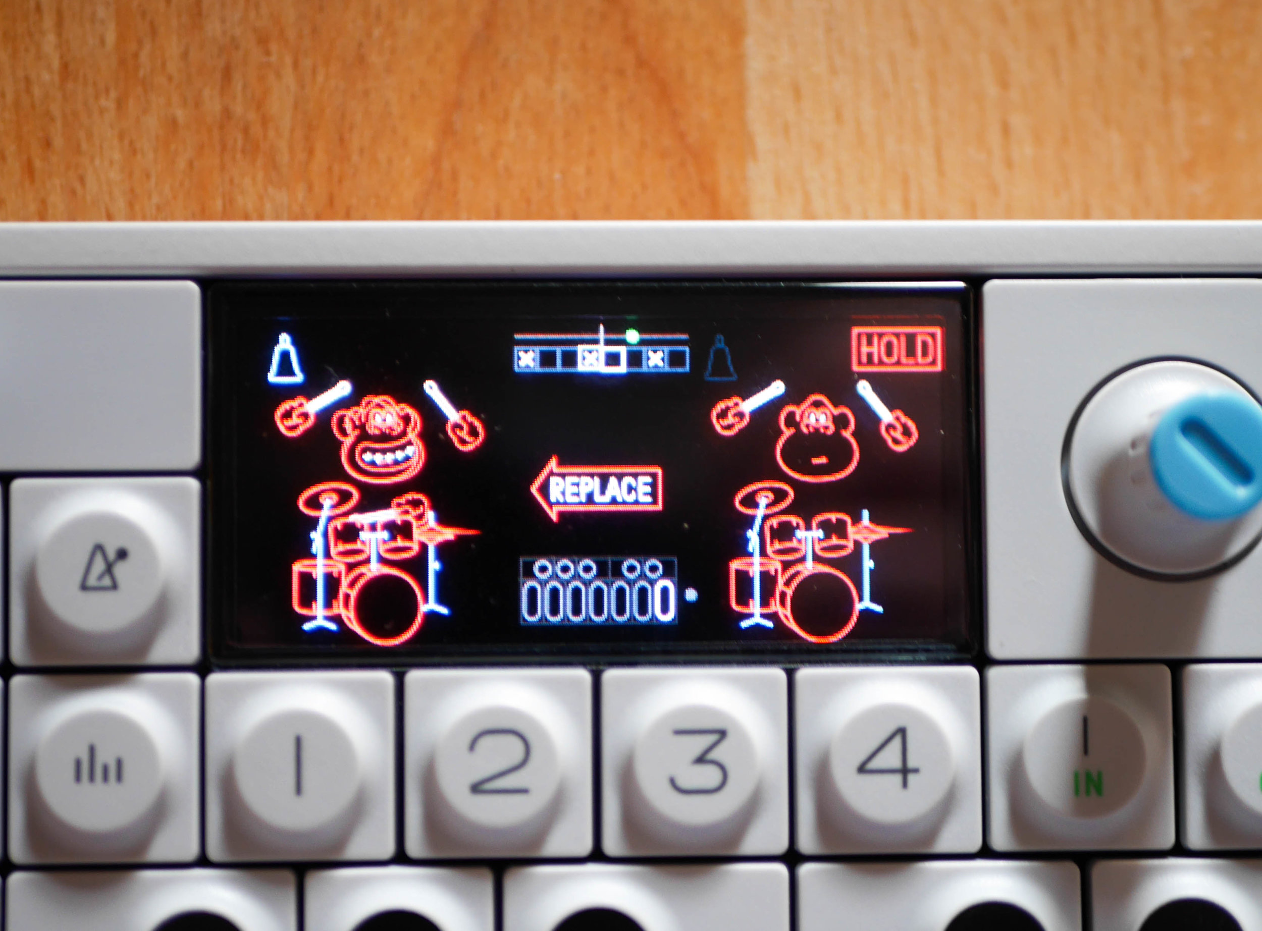
The OLED screen is the heart of the OP-1 where each instrument or effect has a clever, animated graphic that's full of personality which brings this beautiful but somewhat sterile looking synthesizer to life. The animations are quirky and fun and while they're not always the most informative, they certainly are memorable. This is clearly a different take on the synthesizer where traditionally the parameters are very technical and describe audio signal processing terms that are not as friendly to a new user. The OP-1 gives you just enough information to tweak and listen to while you play, giving more of a new exploratory experience that is more fun than it is serious. This more organic composing method is super refreshing in the world of synths.
Overall, the thing that impresses me most about the OP-1 is the amount of detail and thought behind each part that make up with wonderful experience. You can tell that nothing was rushed during it's development and that the team carefully considered each aspect of its design. In additional to its sturdy construction and use of higher end components, its strongest example of quality is the time it took to thoughtfully design it. Each time you pick up it up the OP-1 you find some new detail that you didn't notice before. To add to this, the team is still committed to the project and keeps improving and adding features to the OP-1 for free, keeping its users engaged and excited to see what new feature Teenage Engineering will come up with next. Any product would be happy to have these attributes and they play to the strengths of this inspiring, little digital synthesizer.

