Tivoli Audio : Model One BT Table Radio
Review by Gerry Mayer
The Tivoli Audio Model One AM/FM radio was designed in 2001 and makes excellent use of very precise, modern radio tuning electronics that are also used in cell phones. Since 2001, the form and function hasn't changed much for the original Model One to this latest Model One BT (Bluetooth) version and thank goodness for that. The simple, clean layout of the front panel is charming and nostalgic. The Model One is a celebration of the radio, giving the user access to some of the best feeling analog controls creating a refined and complete radio listening experience.
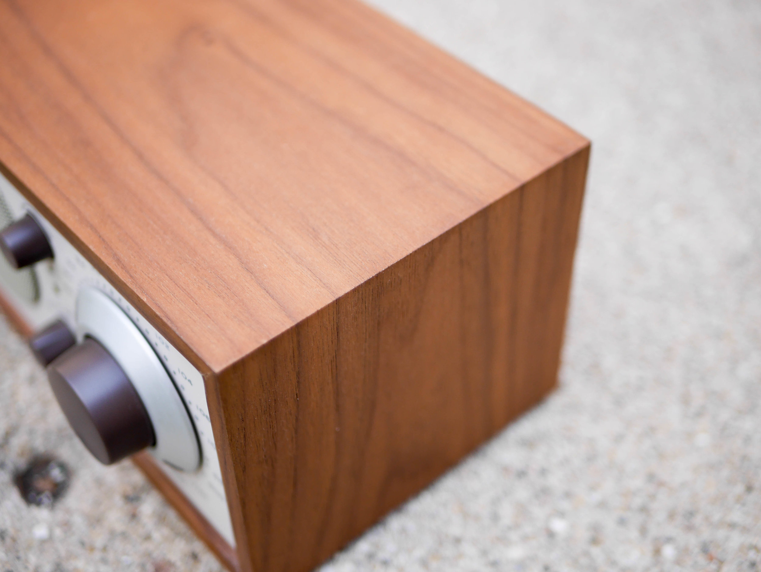
The body of the Model One is a rectangular box with mitered corners, constructed out of walnut veneered MDF. These are very common materials and manufacturing methods that have been tried and tested through the decades of Hifi speaker design. It's clear that careful attention was taken to match the veneer grain pattern on the the corners.
On the bottom, there are four soft vibration isolating feet that do a great job of eliminating any rattling that other objects on the same table might otherwise produce when next to the Model One at full volume. These feel stuck on which raises the question that maybe there could be a more elegant formal incorporation of these feet into the body. Perhaps this could be done by recessing them and protecting the feet a bit more from peeling off down the line. Also hidden away on the bottom is a sound port that helps the single speaker produce very rich and pleasing sonic profile, a perfect stage for radio hosts with those dulcet bass tones.
On the back of the radio there are a sea of ports, text, and some more hints at its manufacturing method. The eight screw holes likely go through all the way to the front panel of the radio to attach it in place. This was a nice design choice to hide these screw holes on the back where, outside of this review, they would likely be never seen. One confusing choice was why some text was pad printed in black instead of using more embossed, single color text. Perhaps there some industry regulations requiring text to be in a contrasting color. I could see a redesign where only using black text for the port labels, the Tivoli Audio logo, and model name that might look more elegant.
The ample amount of ports is great to see and gives the user a ton of flexibility in how they decide to incorporate the radio into their audio setup. Each port is clearly labeled and the recessed area was a great design choice, adding structural rigidity to this under stress area while allowing the radio to almost be flush against the wall if desired. With several exposed Phillips head screws, it seems like the Model One could be easily repairable and will stick with you for a long time.
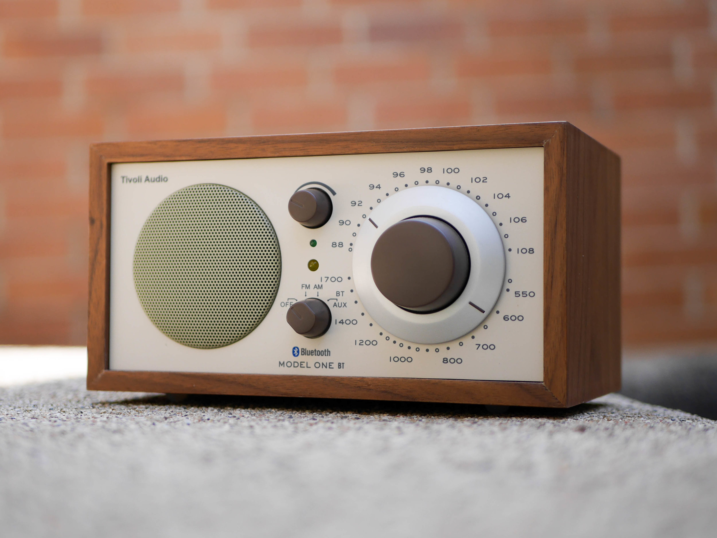
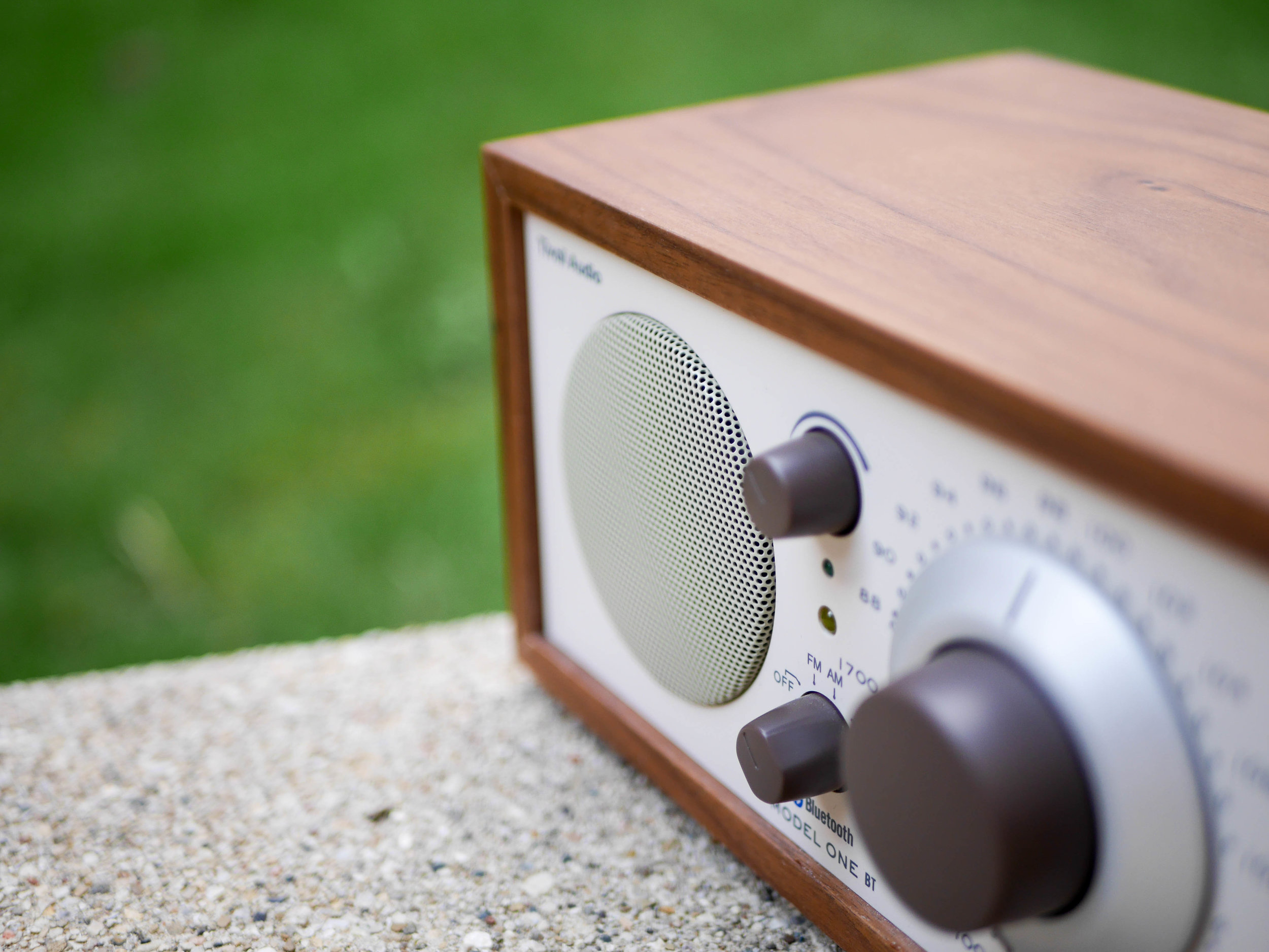
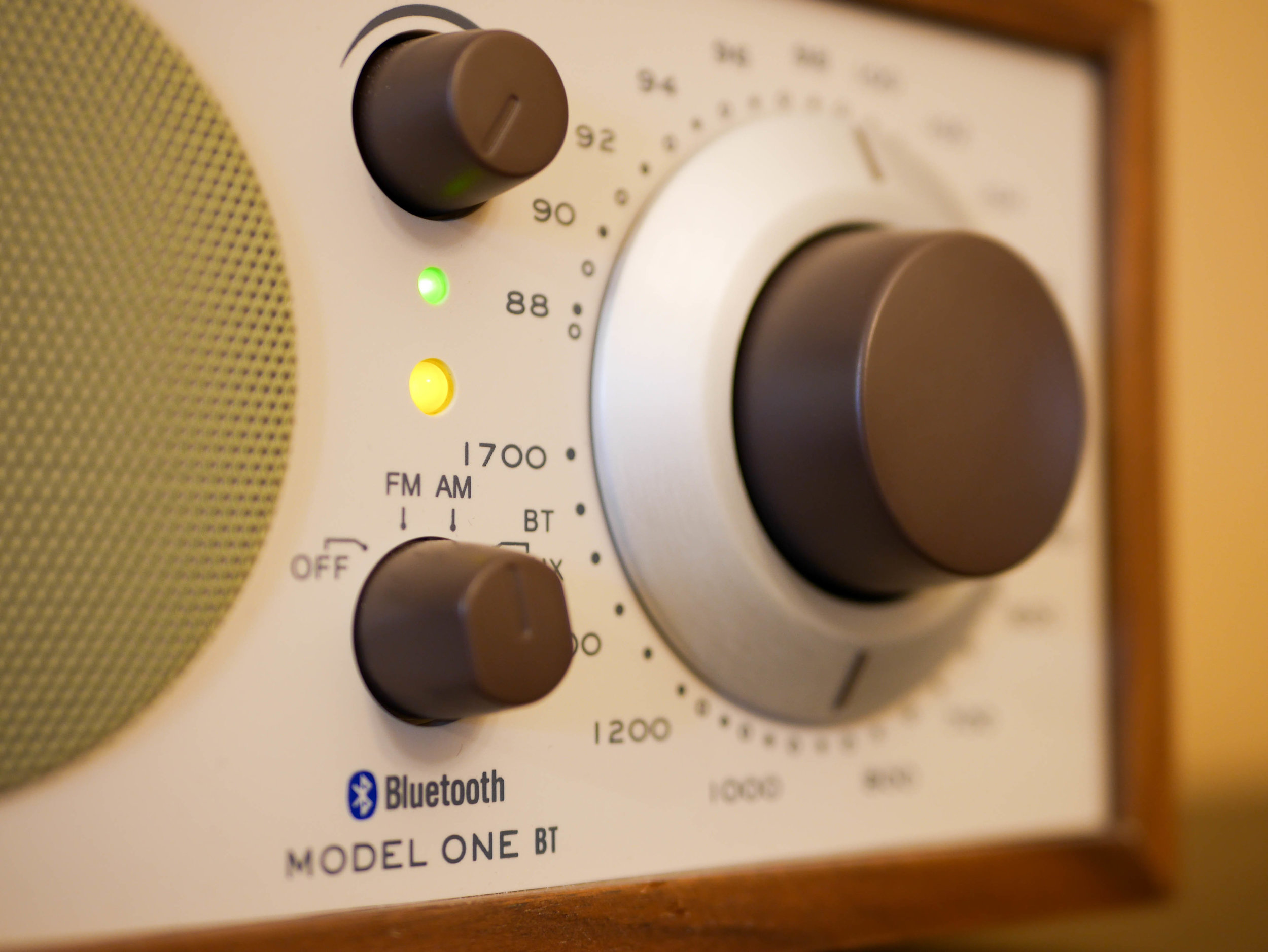
Turning to the front, the four main elements are very nicely framed within the wood box, with plenty of white space and room around them to add helpful labels without looking too busy. The wood frame protrudes from the front panel by a few millimeters and adds depth and a solid posture to the radio's form. The speaker is the largest element, suggesting that the audio is the most important in the hierarchy of the components. Second being the tuning knob and then the equally sized volume and mode selection rotary switches. The circular and rounded controls contrast nicely with the rectangular form of the radio making these element on the front seem friendly and inviting. The choice of having one speaker for mono audio was made to keep the important visual and symbolic balance between the importance of tactility and sound in this radio. If desired, stereo sound is provided through several different audio port options.
On the speaker, this rounded theme was continued within the pattern of the grill as well as the elegant radius of the edge that disappears into the front panel. The grill is also rounded out in a subtle dome shape adding more structural rigidity to an otherwise easily bendable material. The choice of a white grill with black holes instead of something like completely black grill helps to shade it in like a comic book and changes the value of the speaker shading so there is a medium contrast between it and the white front panel. In this way, more contrast is given to the knobs drawing the eye towards them.
The three brown plastic knobs have a tapered cylindrical form with domed tops making them pleasing to touch. The size difference of the tuning knob on the right compared to the volume knob at the top lets the user precisely dial in the correct frequency, where the volume doesn't need to be as precise. Each knob is has buttery smooth action and is mounted very solidly to the radio with no wiggle showing Tivoli Audio's careful attention to manufacturing quality. The volume and mode selection knobs have subtle but helpful rounded rectangle indicators. In contrast, the tuning knob indicators are hard cornered rectangles, making them the only rectangular elements on the front panel, perhaps a tiny missed detail.
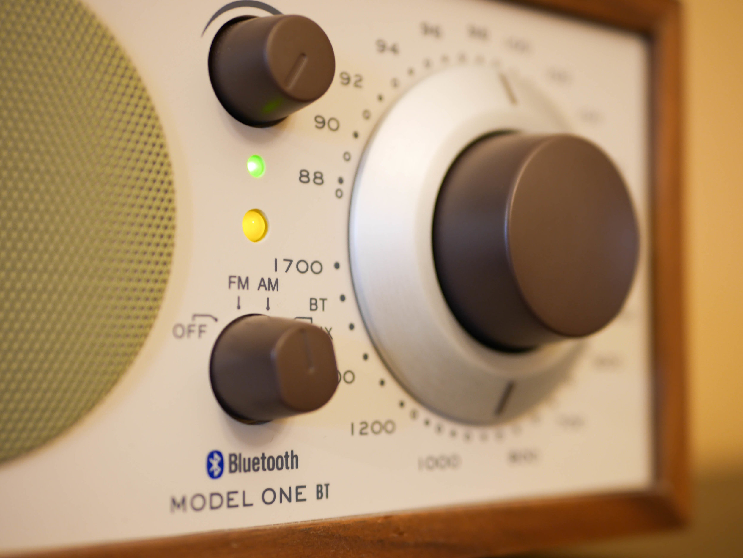
Zooming on the details of the tuning knob reveals some beautifully simple surfacing over the two main parts, the brown knob and the metal indicator ring. There is a smooth fillet on the edge of the knob that gives the it a touch friendly edge as you dial in your radio station. When moving the inner brown knob, metal ring and two indicators move at different rates on the top FM and bottom AM scales. The metal ring is tapered towards the front giving dimension and perceived quality to what is most likely a flat sheet of formed metal. This moving metal indicator ring gives captivating movement to the otherwise static object.
The two smaller volume and mode select knobs are similar in size but feel different which is a nice affordance used to tell them apart in the dark. The mode select has four positions you can switch between, which also incorporates the power switch for the radio. The volume knob has the same super smooth rotation as the tuning knob. The gap between the volume knob and front panel seems to be larger than than the gap on the mode select switch, another small detail that could be improved in the future
There are two LED indicators on the Model One, a small green one and a larger amber LED below it. The power LED stays on at a consistent brightness and the amber signal strength LED gets brighter as you tune closer to the station and gets dimmer as you tune away. This is a really interesting way of showing the signal strength which gives additional visual feedback in a simple way, compounding with the auditory feedback of static or clear audio. I wonder why the green power LED is smaller then the amber one, maybe if they weren't right next to each other the size different wouldn't be as noticeable, but why not make them both big?
With a iconic design, tactile controls, flexible playback options, and focus on high quality audio, Tivoli Audio has produced a desirable radio that unites modern day technology and nostalgic, timeless styling that updates and in many cases introduces the analog style radio experience to the current market. Being able to dial into your favorite station is a meaningful tactile experience that isn't found with instant tuning, digital radios that have favorite buttons. Hearing the static is a historically important aspect of radio experience but is also an important sensory experience where the user is rewarded for discovering a clear and pleasant station out from the abundant harsh static. With the current state of electronics, this inclusion of static had to be conscious choice that Tivoli Audio made for their modern radio and this thoughtfulness makes their radio a real treasure for all radio lovers to enjoy.

